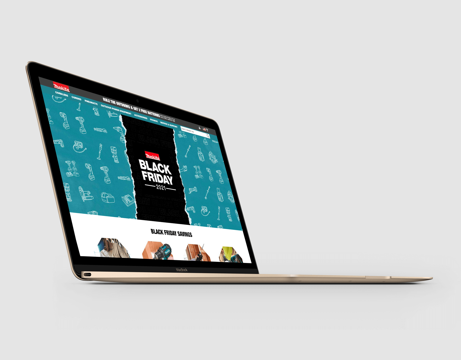
Before
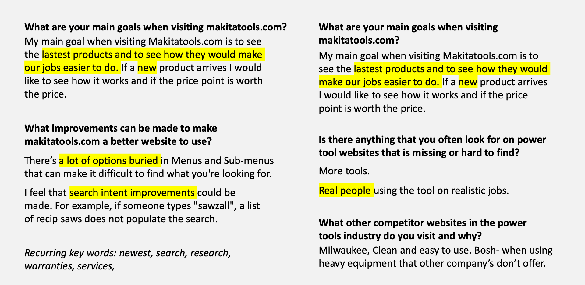
Questionnaire
Specific questions were made in order to better understand the needs and frustrations of our users. Altogether, more people wanted improved ways of navigating through the site whether it was a better search bar or categorizing content more.
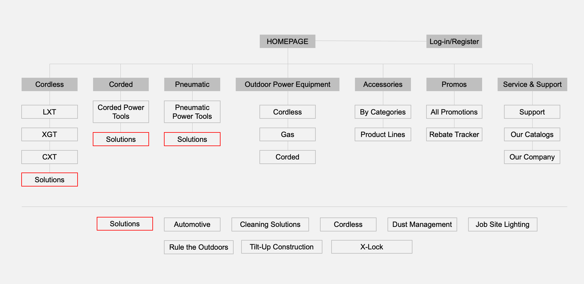
Sitemap
In order to streamline tool categories, one of the main goals was to reduce repetitive groups buried in the navigation bar. The Solutions category was one that was repeated over three different tabs and the decision was made to make it its own category in the main navigation menu.
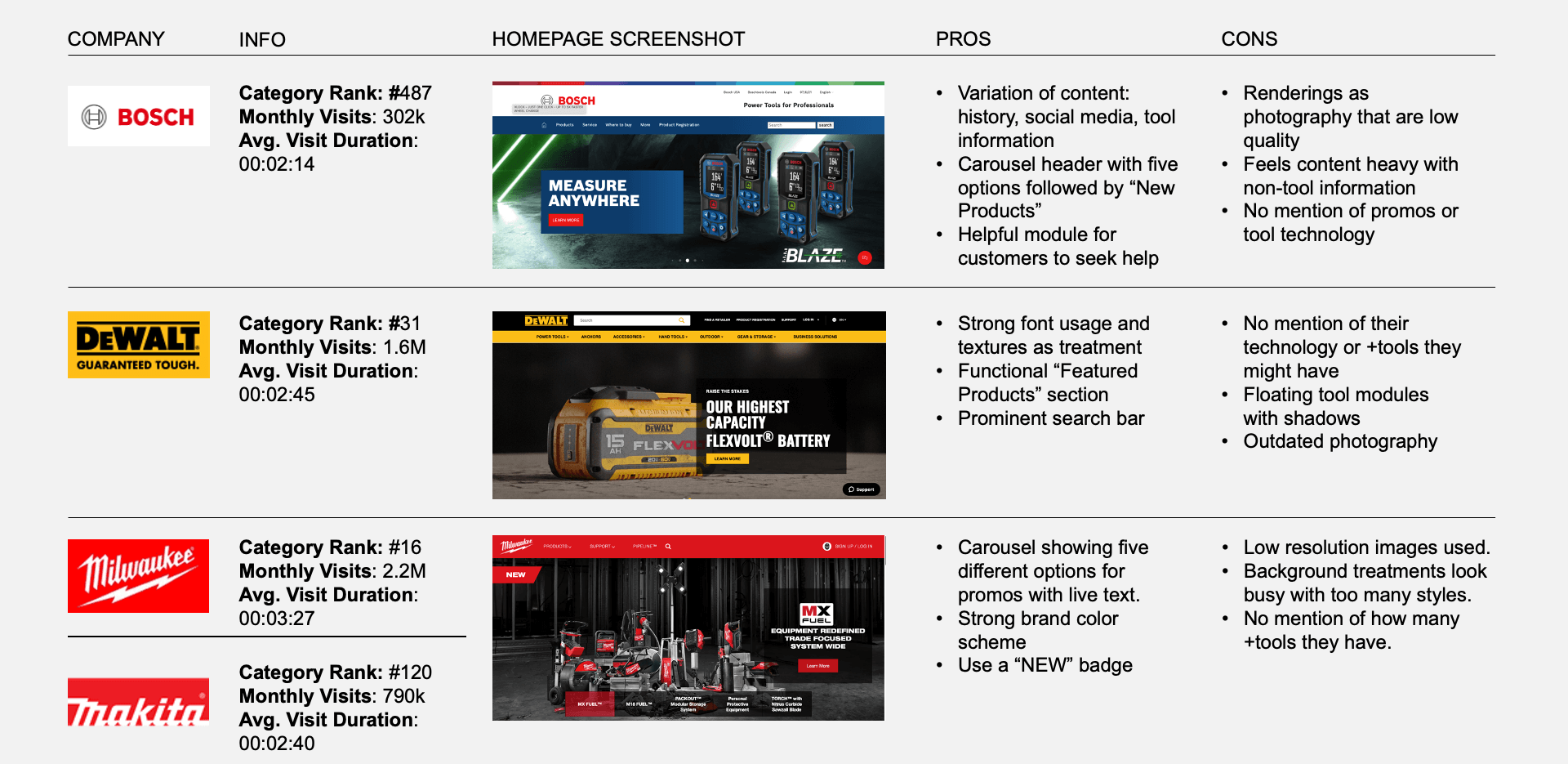
Competitive Analysis
An analysis was made to compare pros and cons from various competitors in the same industry. A prominent search bar and optimized categorization were amongst the strongest factors. An area where the Makita brand would be able to stand out is by producing better storytelling with the use of high quality photography compared to other competitors.
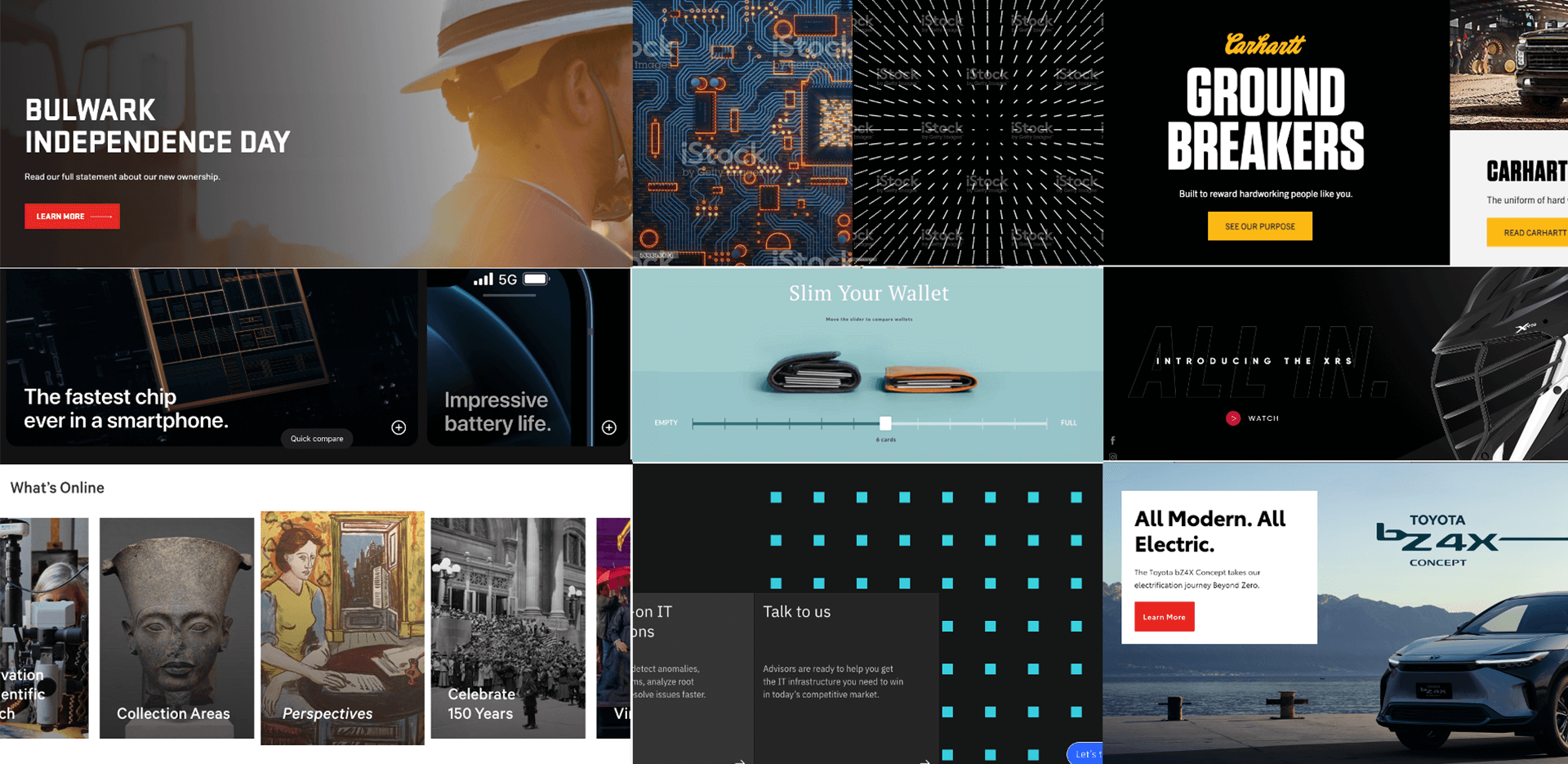
Inspiration
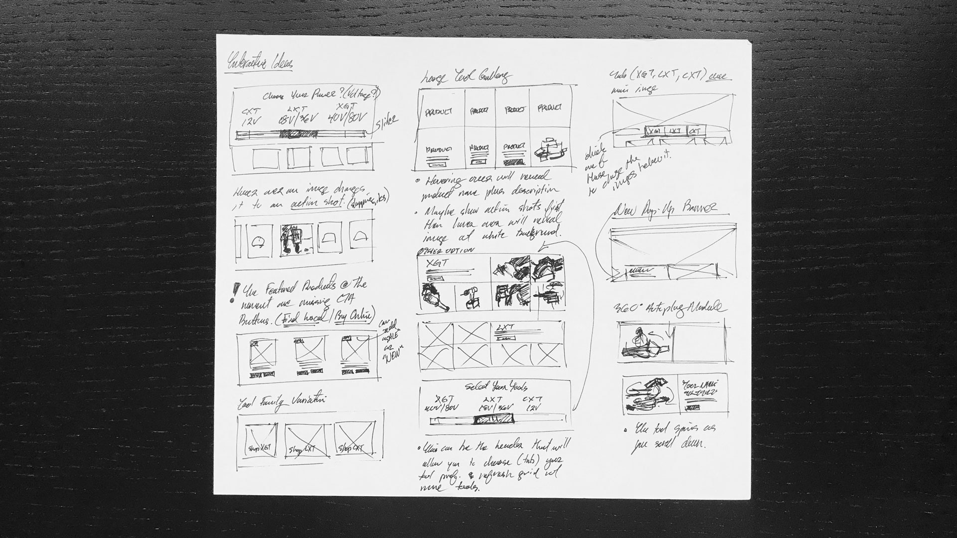
Different design styles were explored to give the Makita website a refreshed and modern design style. Special attention was given to add more negative space to let content breath more and increase image sizes to make tool details more visible. Part of the Makita story is the three different systems of tools it has launched over the years. This meant that a simple but effective visual solution was needed to make it clear to users which tool family better suited them.
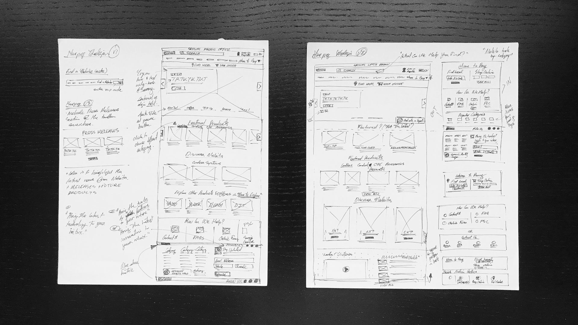
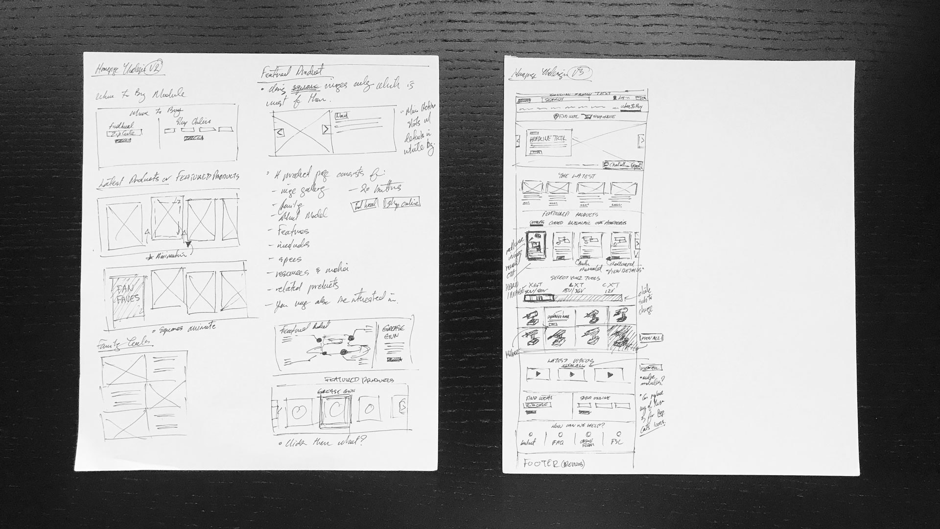
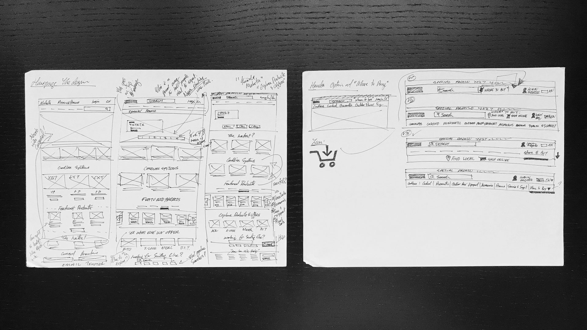
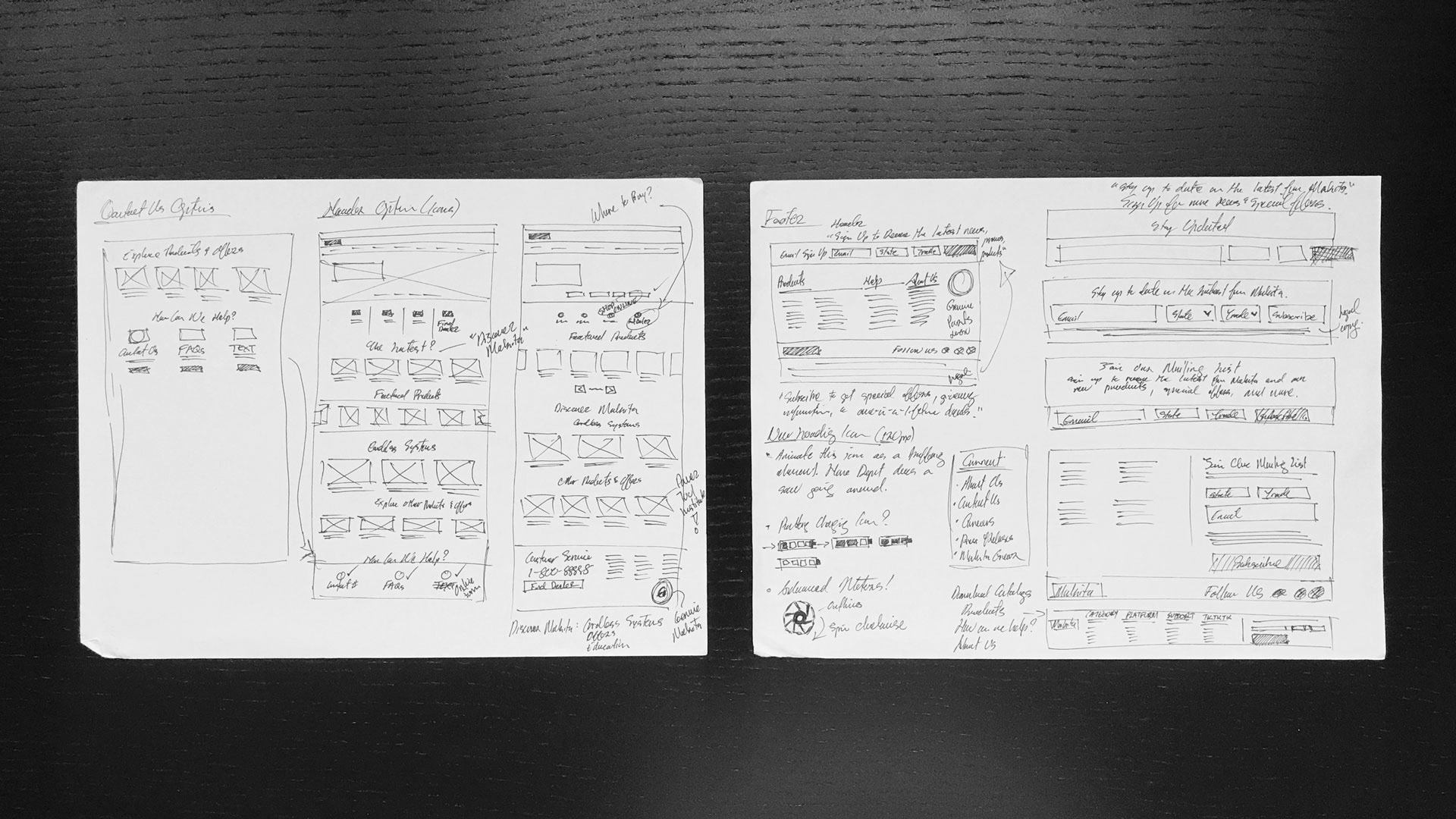
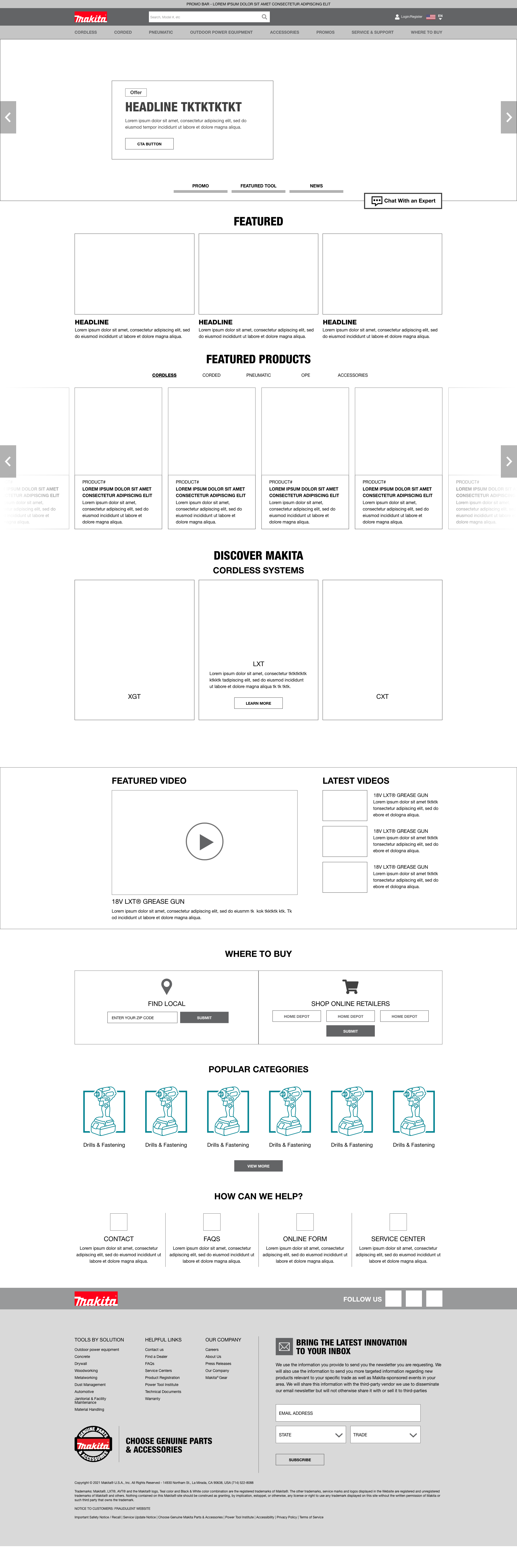
Low Fidelity Wireframes
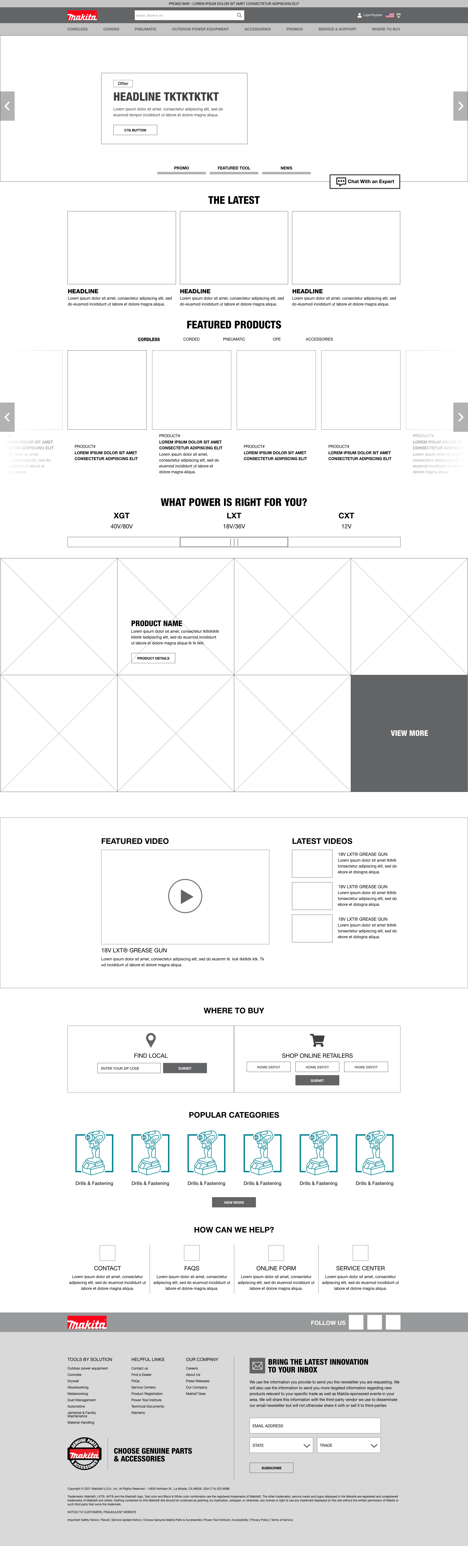
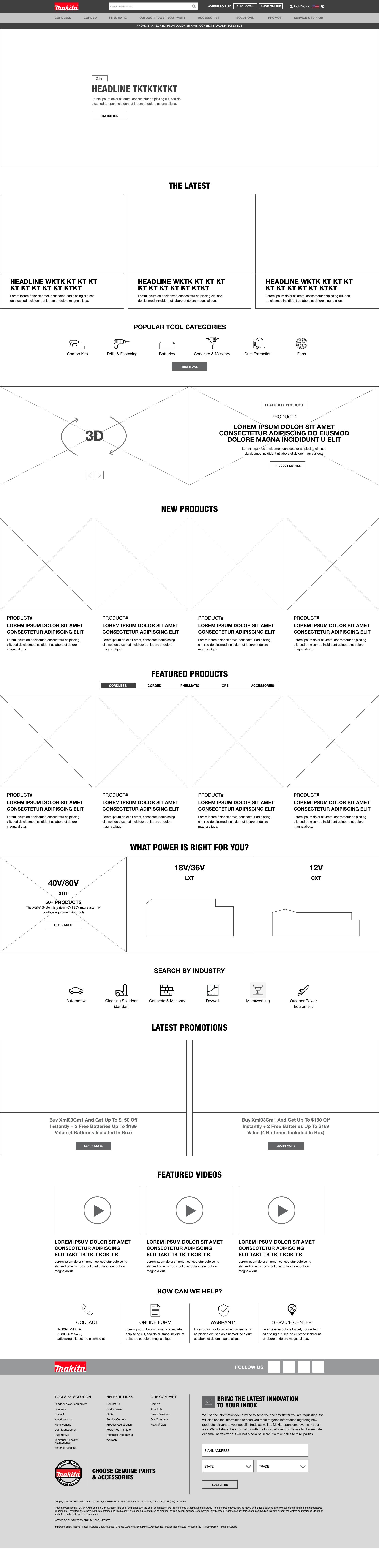
High Fidelity Wireframes
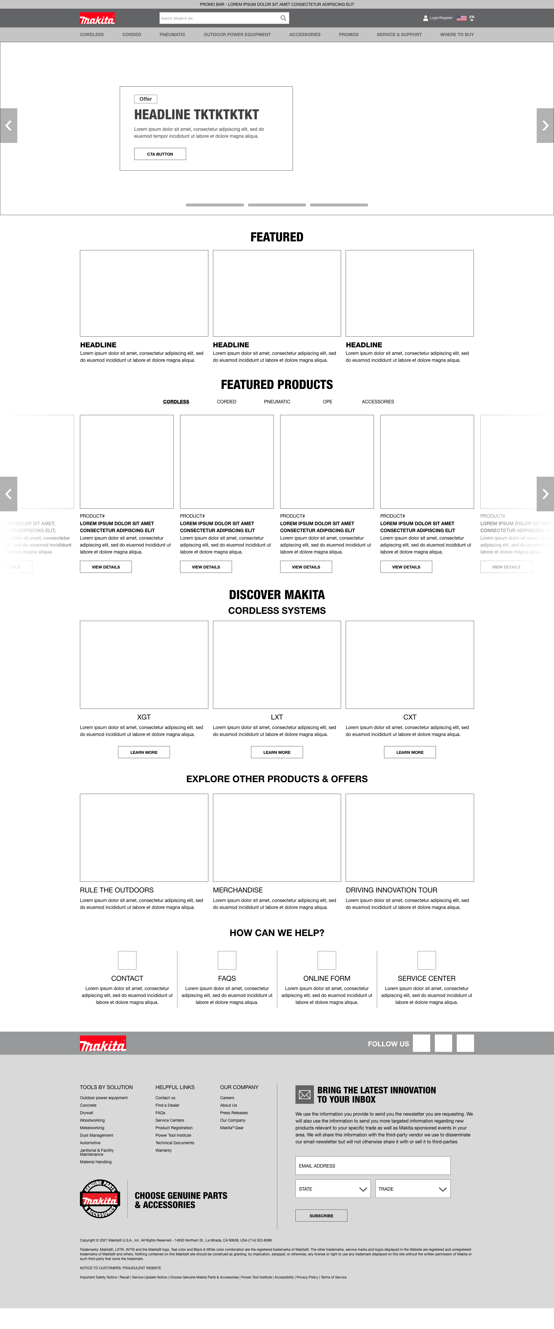
Four different homepage designs were proposed to launch the homepage redesign. A careful balance had to be made between showing too many products that might make the website feel like a catalog and how much of the brand story was told on the homepage.
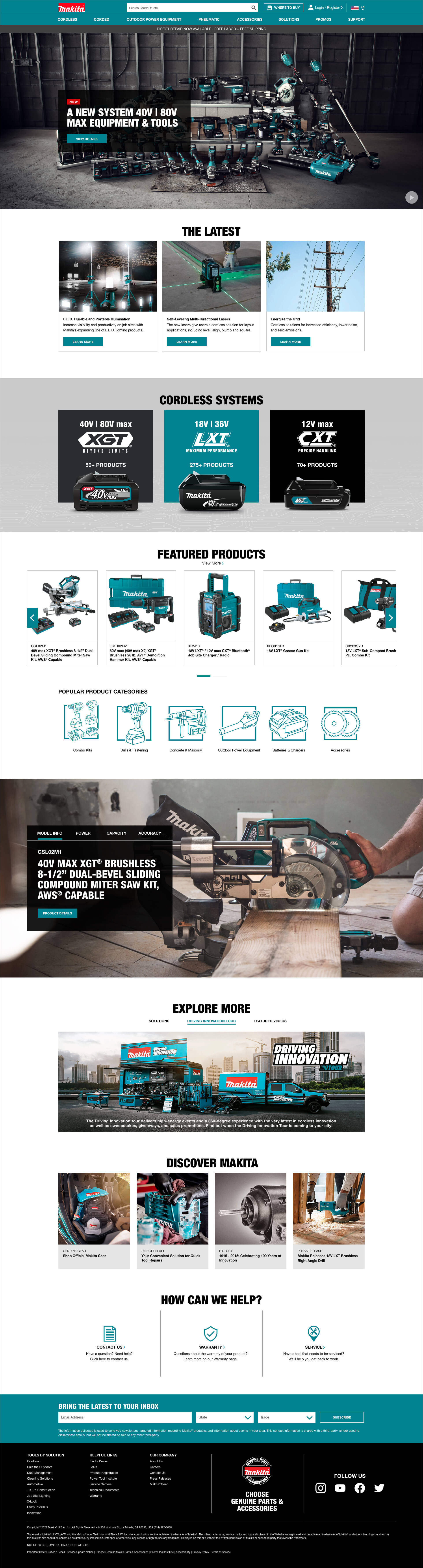
After
With over 100 years of history in the industry, Makita has become the leader of innovation in its industry. As its tool systems begin to grow, the website needed to reflect that forward progress and provide users with a better experience when it comes to viewing the tools to help them to get the job done. Image rollovers were added in order to show the tool in action and instantly tell the story. An emphasis was also made on highlighting the technology behind the tools and clearly explaining that with curated copy. For vendors, more tool categories were created through icons and the navigation menu reorganized.
User Registration Page
Mobile Design
With over 60% of traffic coming through mobile, the homepage redesign was also given a mobile refresh. Careful testing was performed to maximize image and copy sizes as well as the flow of the Makita story.
Product Details Page Redesign
Before
After
Product Details Mobile Redesign