1. The Challenge
The ROW8 Roku app is the movie lovers’ service dedicated to making it easier for them
to get Hollywood hit movies. This was a case study in which I wanted to explore how discounts could be included into the app to provide a better user experience and separate it from its competitors.
to get Hollywood hit movies. This was a case study in which I wanted to explore how discounts could be included into the app to provide a better user experience and separate it from its competitors.
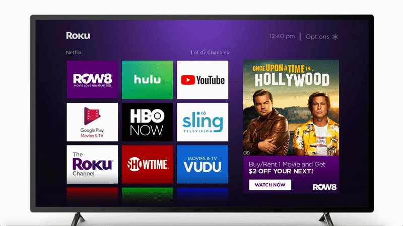
App Launch from a Roku Device
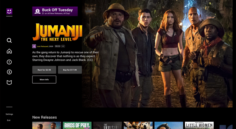
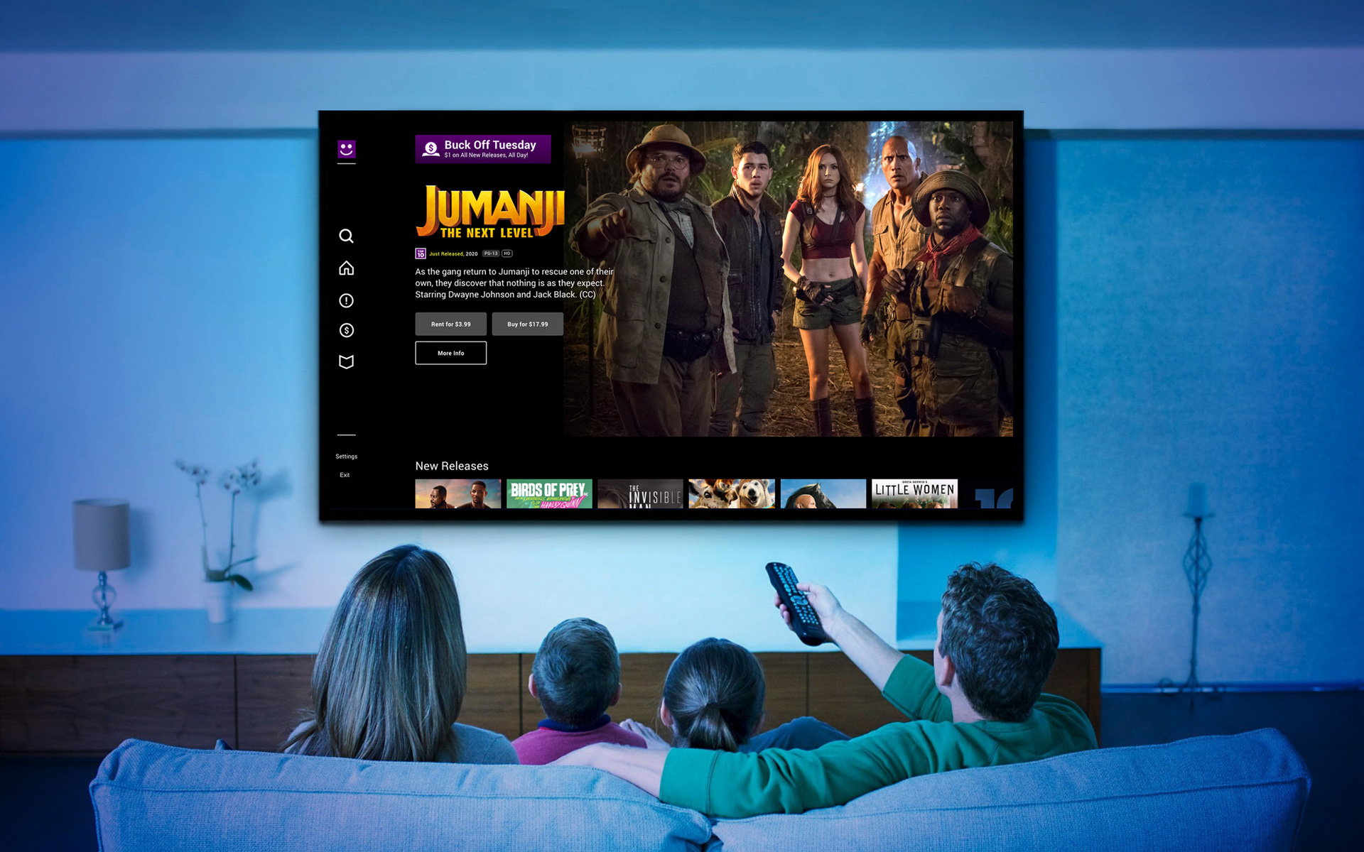
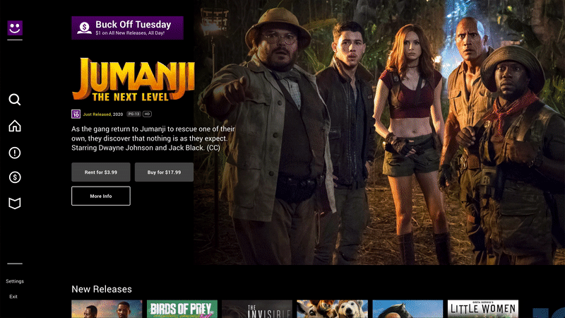
Renting a movie from the home page
2. Customer Insights
I interviewed video streaming users to see what they love the most about their favorite streaming apps, their frustrations, and features they would like to see to better enhance their experience.
• What is your main goal when visiting the application?
• What would prevent you from achieving watching a movie?
• What improvements could be made to make watching movies easier or better?
• What are the most important tasks you or other people need to perform in using the app?
• How would you describe your past and current experience with the ROW8 app?
• How often do you use or see yourself using a movie streaming app like ROW8?
• Do you or did you in the past use other websites or apps to rent movies online?
• Is there anything you often look for in a movie streaming service that is missing or hard to find?
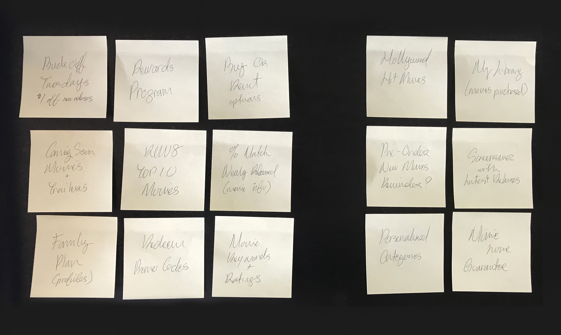
3. Affinity Mapping
Discounts were something that this app needed to focus on in order to provide an edge over its competitors. Specials on the latest released Hollywood-hit movies such as Buck Off Tuesdays and a Rewards Program would be central in attracting new customers.
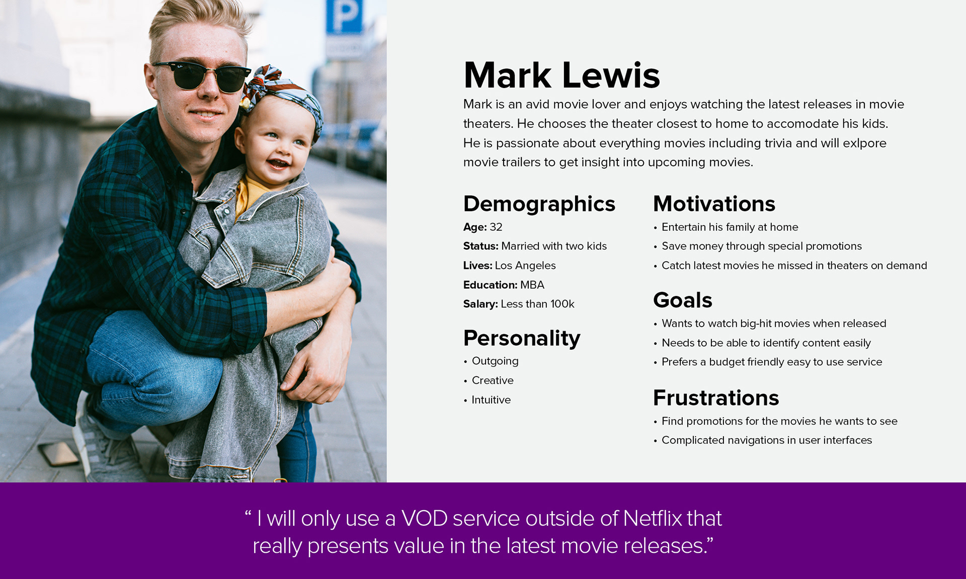
4. Persona
The persona needed to be a movie buff who was well informed on movies because this kind of person would likely be aware of new releases. Clearly placed promotions would need to be highly visible for a person like Mark to come home to and find a good movie when a night in were the preferred option rather than a trip to the movie theater.
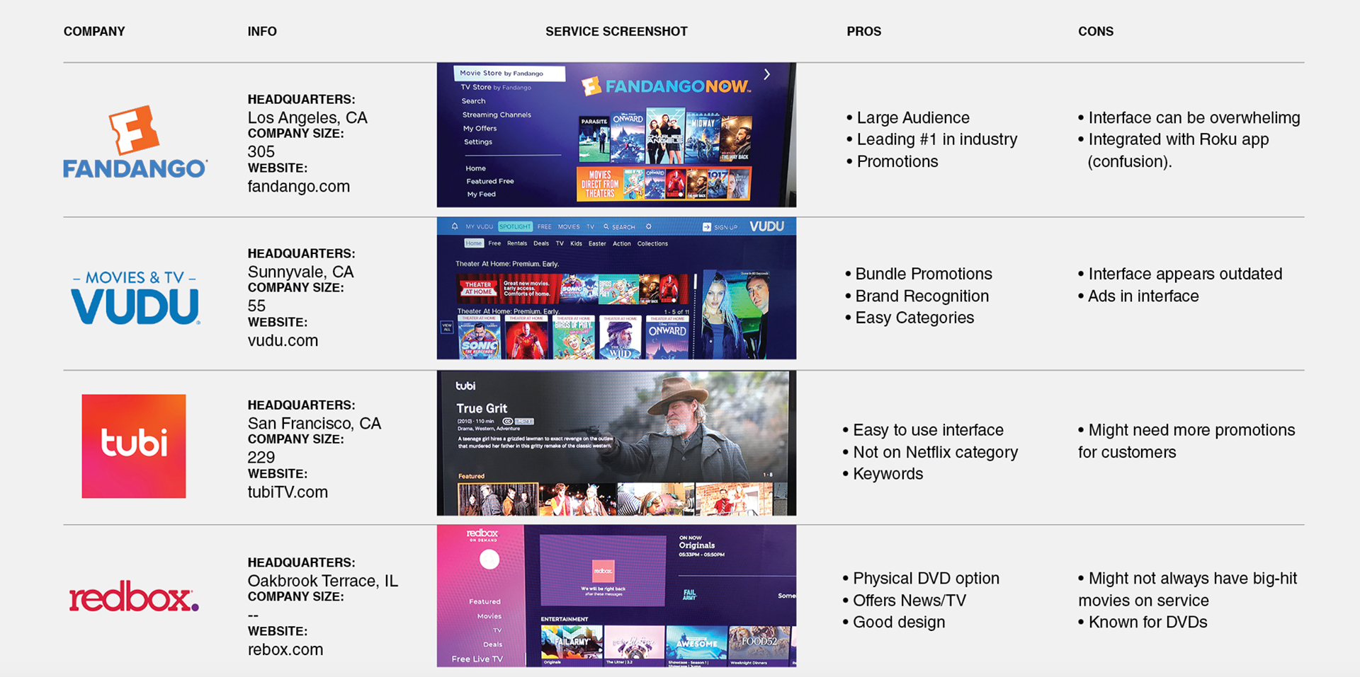
5. Competitive Analysis
Most competitors lacked a cohesive way to present a feature movie experience while having promotions become too busy on the screen. A clear rewards program was also something that few services provided.
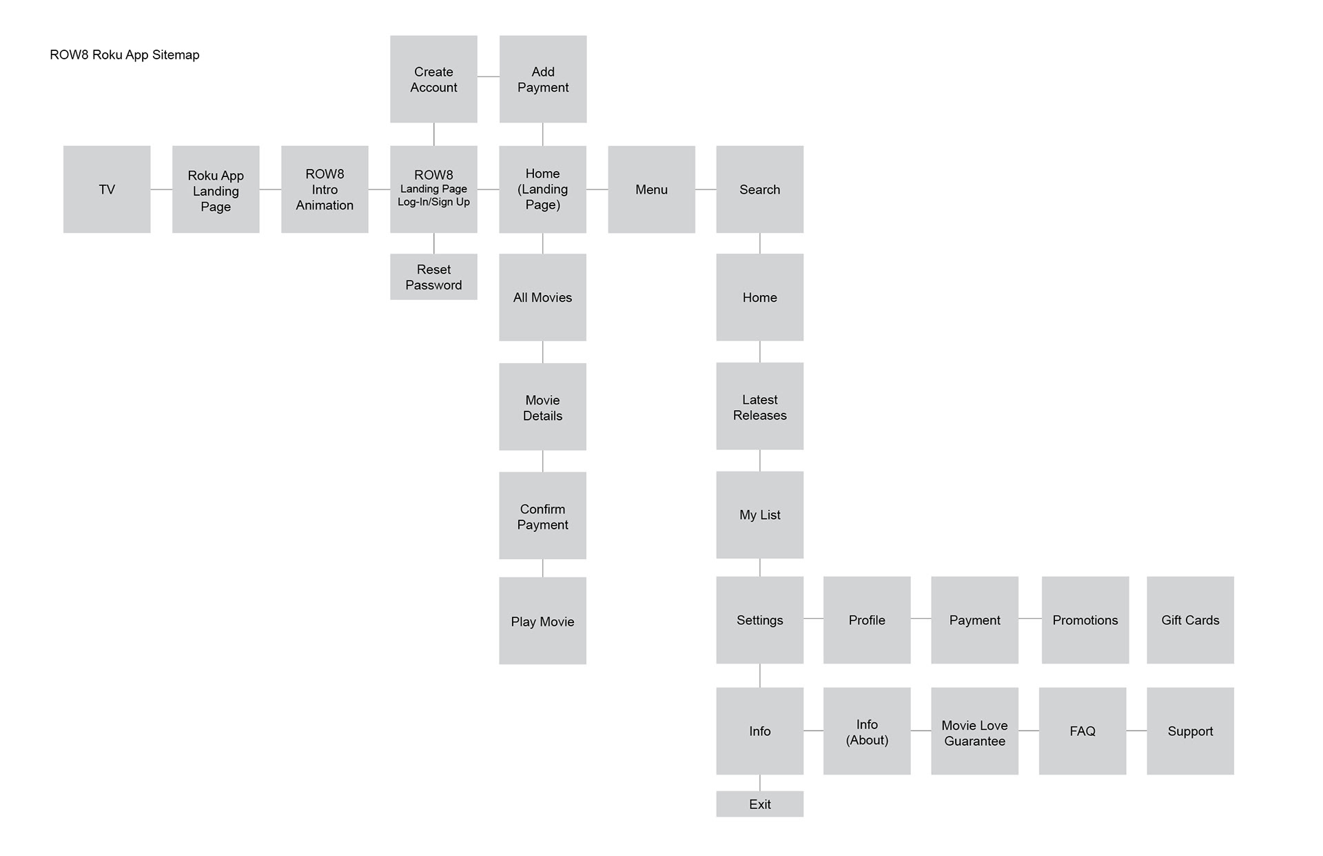
6. Wireframes
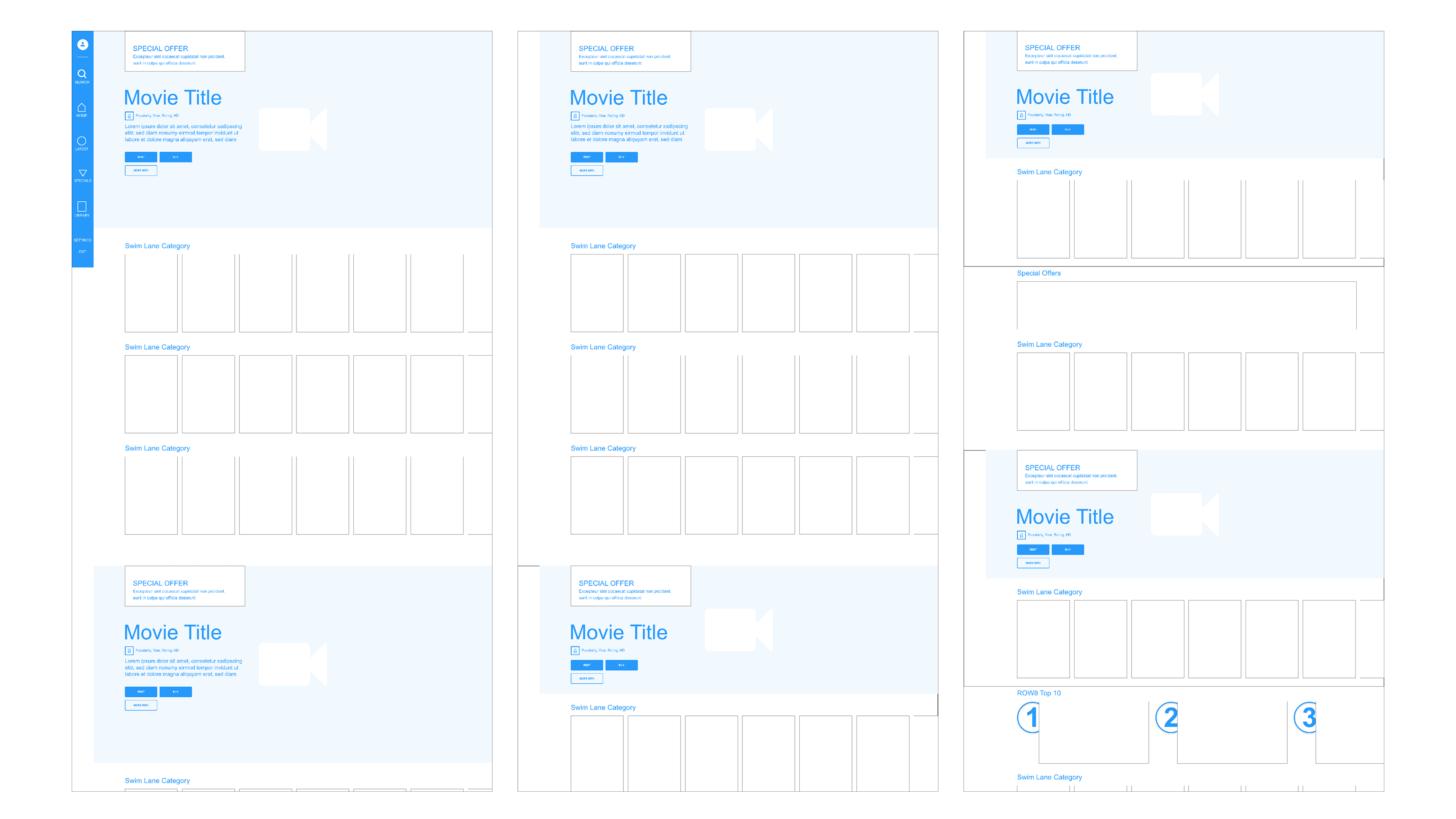
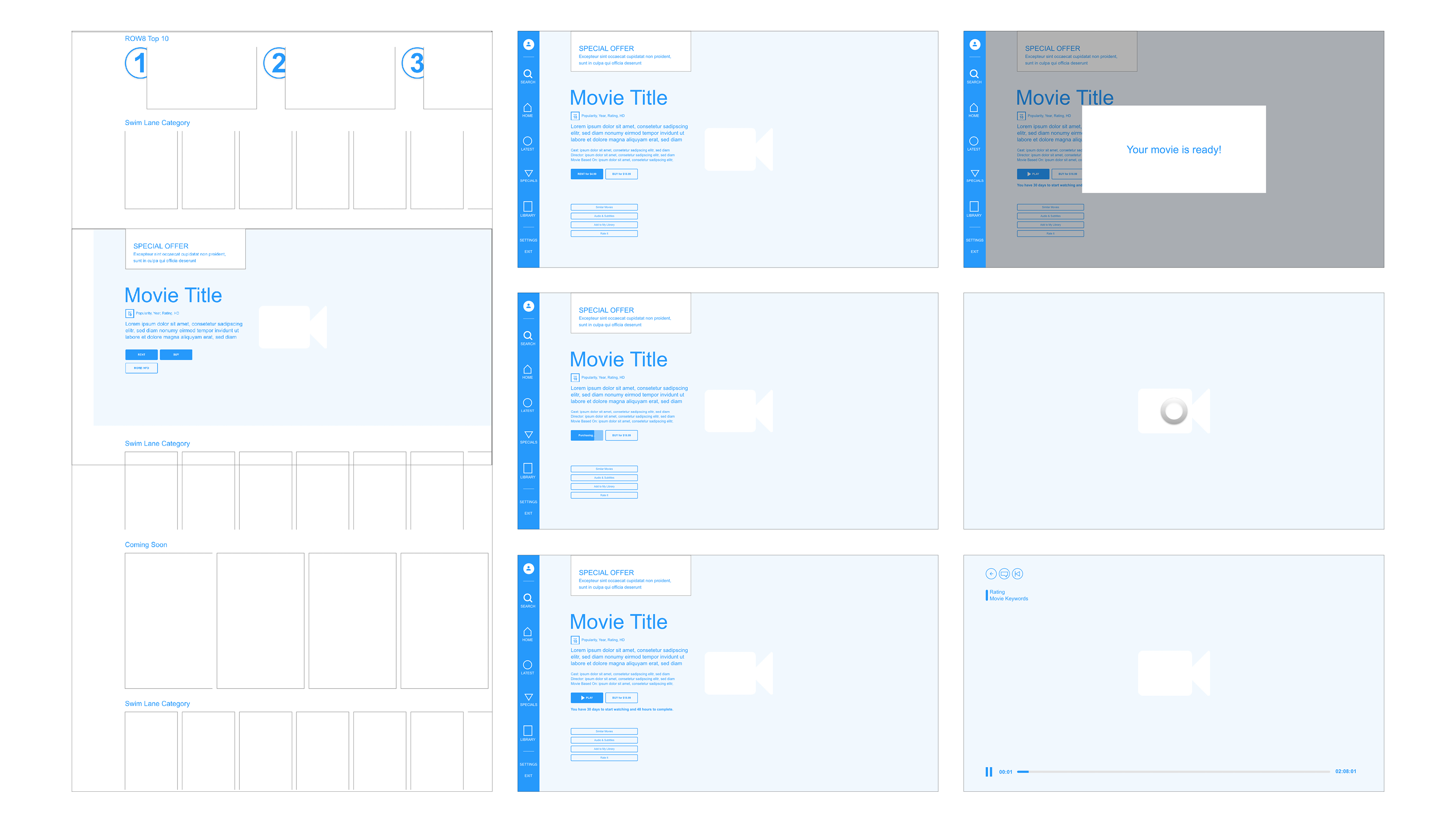
The homepage design took priority and the most attention in order to provide a seamless and pleasant experience. It was important to have most of the features of the app right on the homepage in order to reduce the amount of clicks a user would need to make and to avoid burying attractive offers.
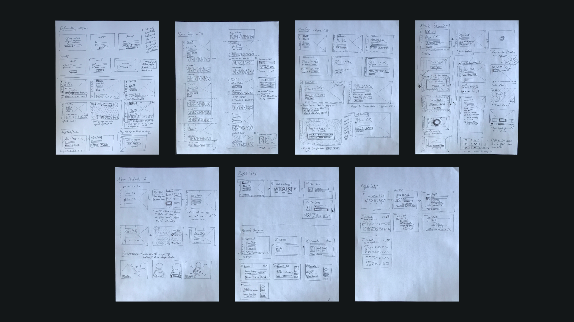
As the work progressed, an imperative factor that arose was maximizing the visibility of the movie key art. The latest feature movies were given more room to fill the screen and appeared higher up in the homepage. As you moved down, that spaced would get halved in order to show more options from the movie library.
7. Moodboard
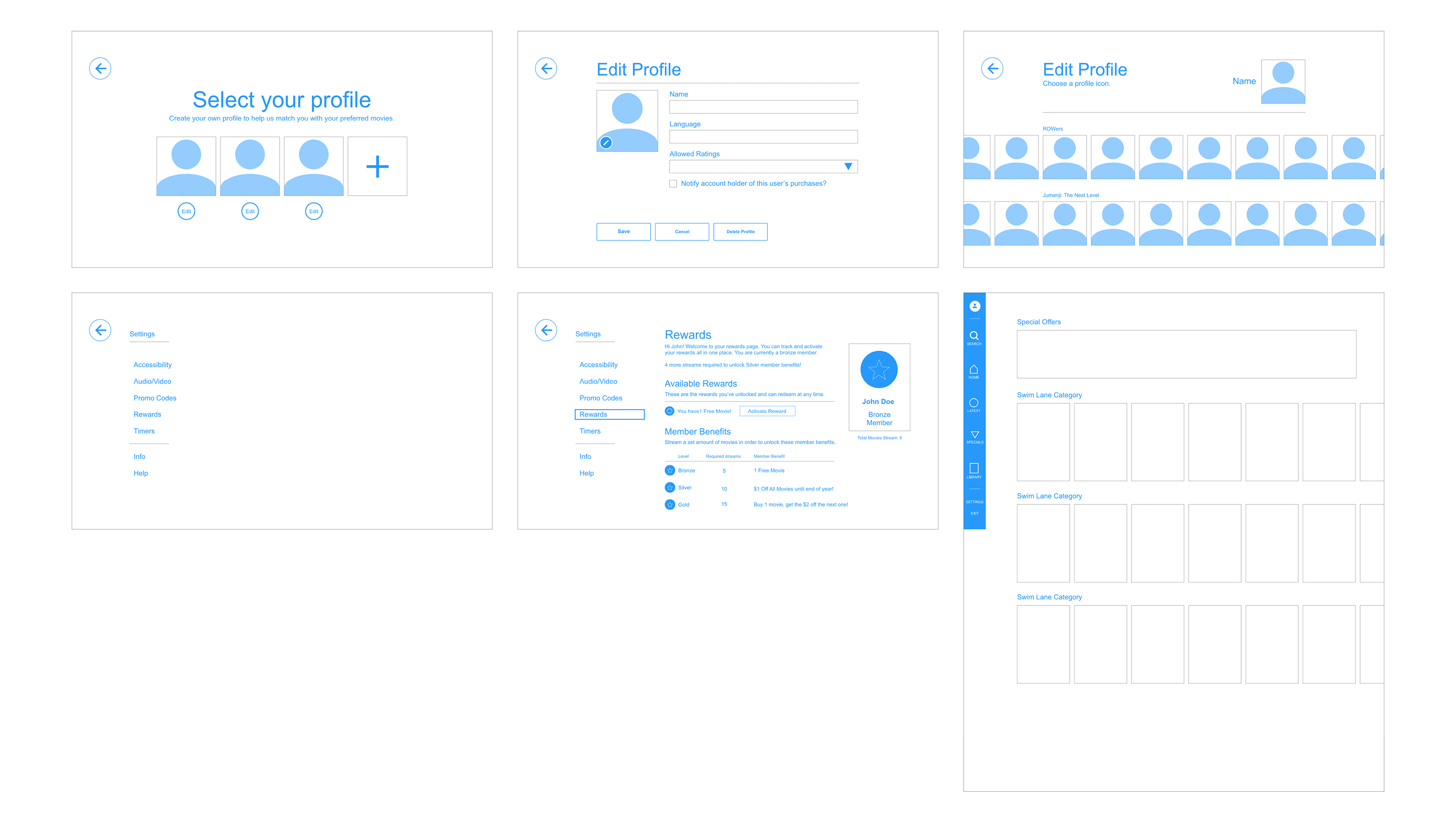
It was important to achieve a design style that would maximize key art visibility and type treatments that would prove to be effective in legibility from across the living room. More creative freedom would be allowed in the menu options of the app such as the Profile page in order to provide a playful approach that someone like our persona Mark would enjoy along with his children.
8. Vision
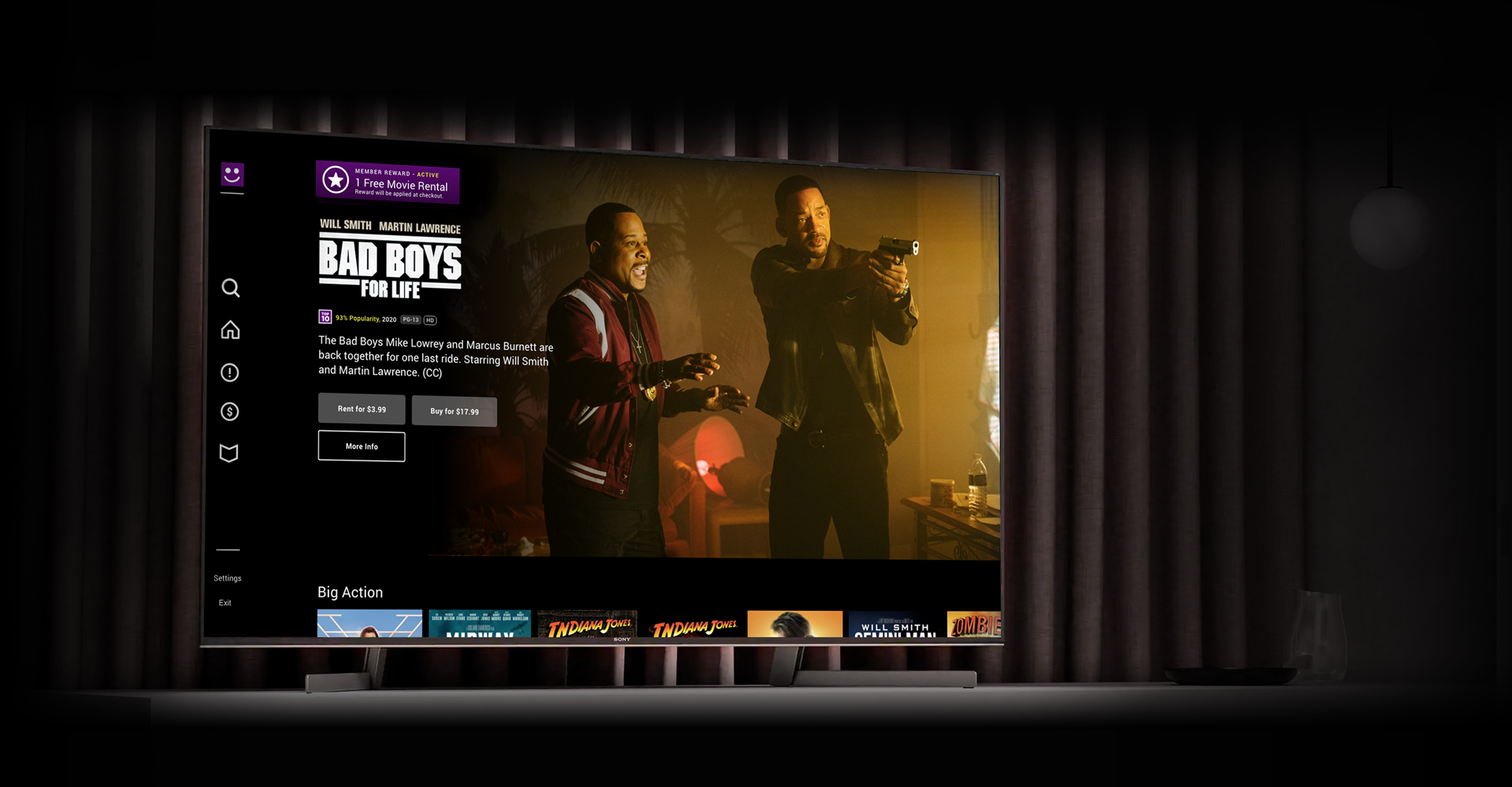
Here are the final designs for the ROW8 app. The ROW8 purple was used as a dominant color to reinforce branding while keeping mostly all other components neutral. This in turn kept the focus on the movie key art. The distance that a TV is usually from a couch, about 5-7 feet, was continually kept in mind when sizing text and images.
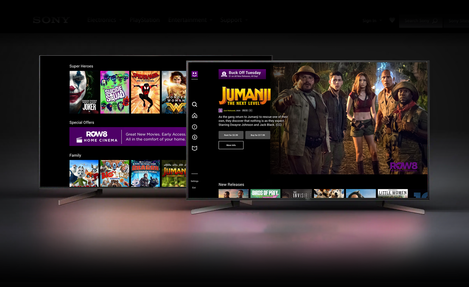

The menu bar, anchored and aligned to the left of the screen, allowed for easy guidance and presented icons for more fluid navigation. This also saved room to allow larger movie images to be displayed across the screen.
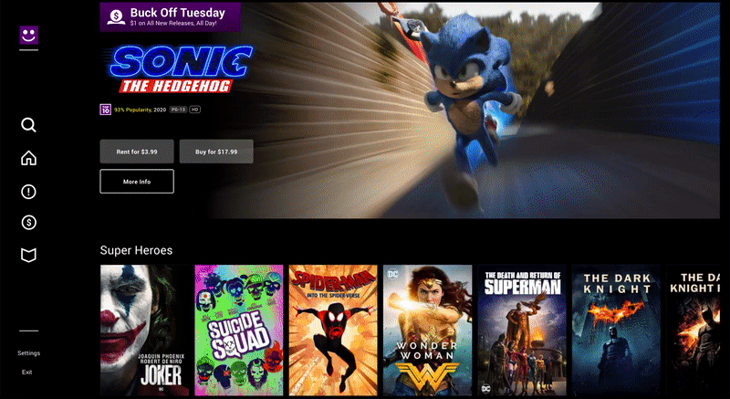
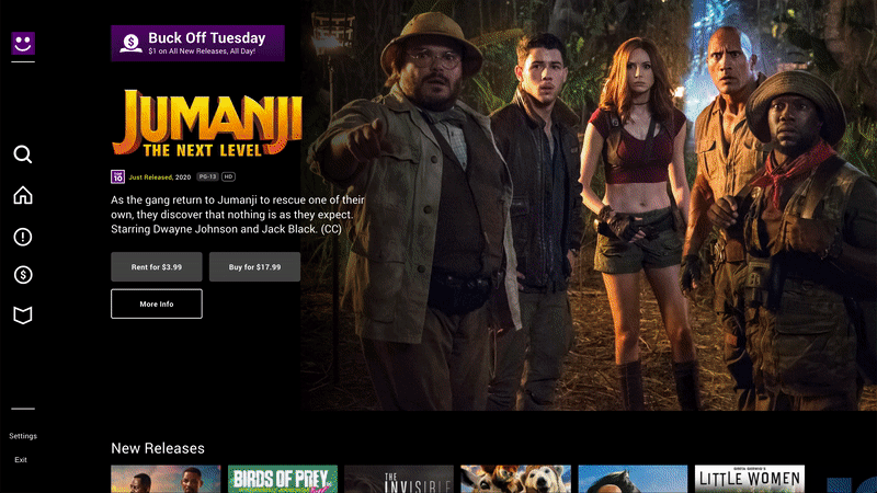
Rewards Program Offering Movie Discounts
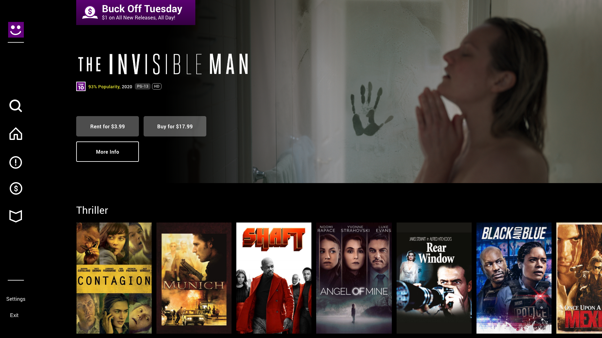
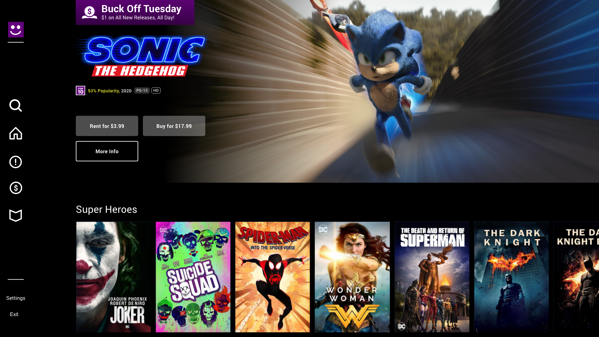
Discounts such as "Buck Off Tuesday" and a rewards program was an essential feature that the app needed to have. A banner featuring the present discount or a reward is placed in the top left corner where it does not interfere with the rest of the layout components.
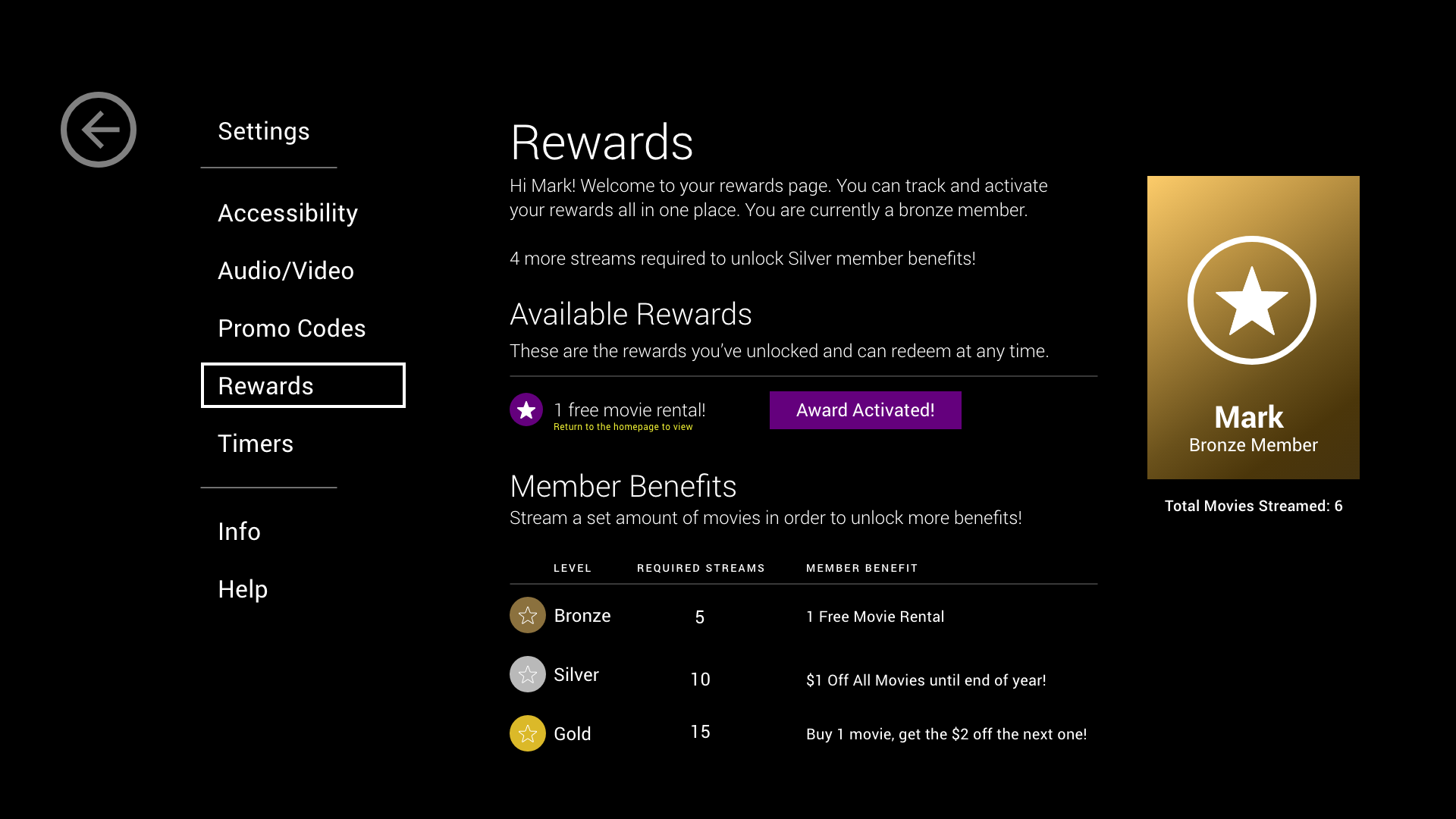
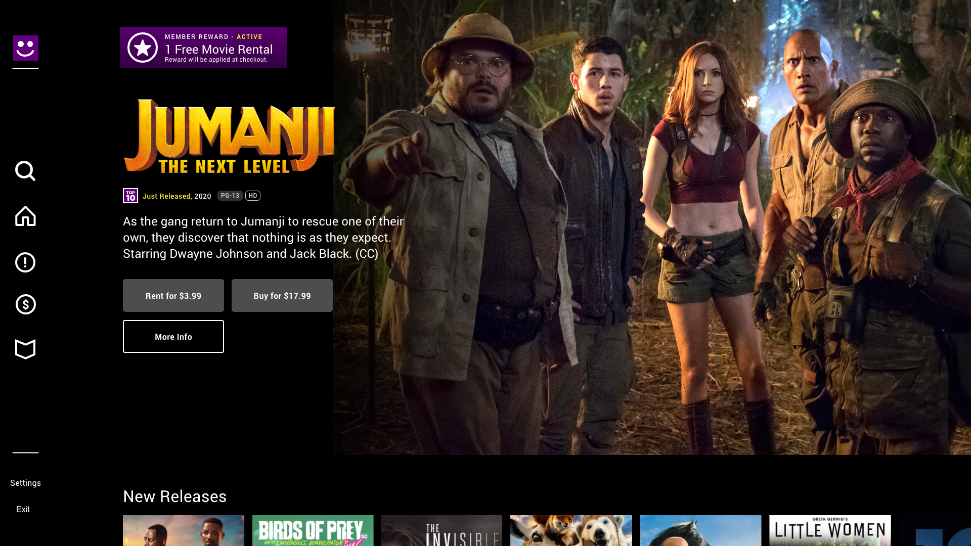
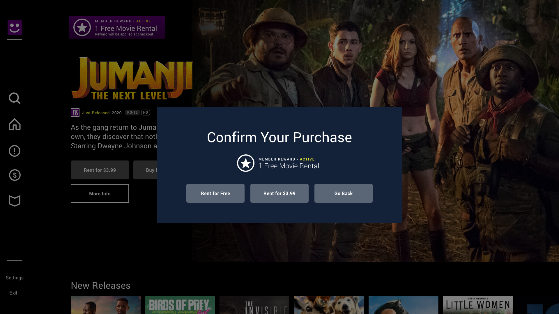
A user could keep track of their rewards by visiting the Settings tab. There they could see rewards that were available to them and activate those they want to use. Careful attention was given to providing the correct messaging to the user once a reward was activated by using the rewards logo, an encircled star, all the way through checkout. They also had the option to save it for later if they wished to do so.
This would also build customer loyalty in a consumer like our persona Mark. Parents renting or buying the latest kids movies would eventually unlock new benefits through Silver or Gold status that would save them more money and presenting greater value.
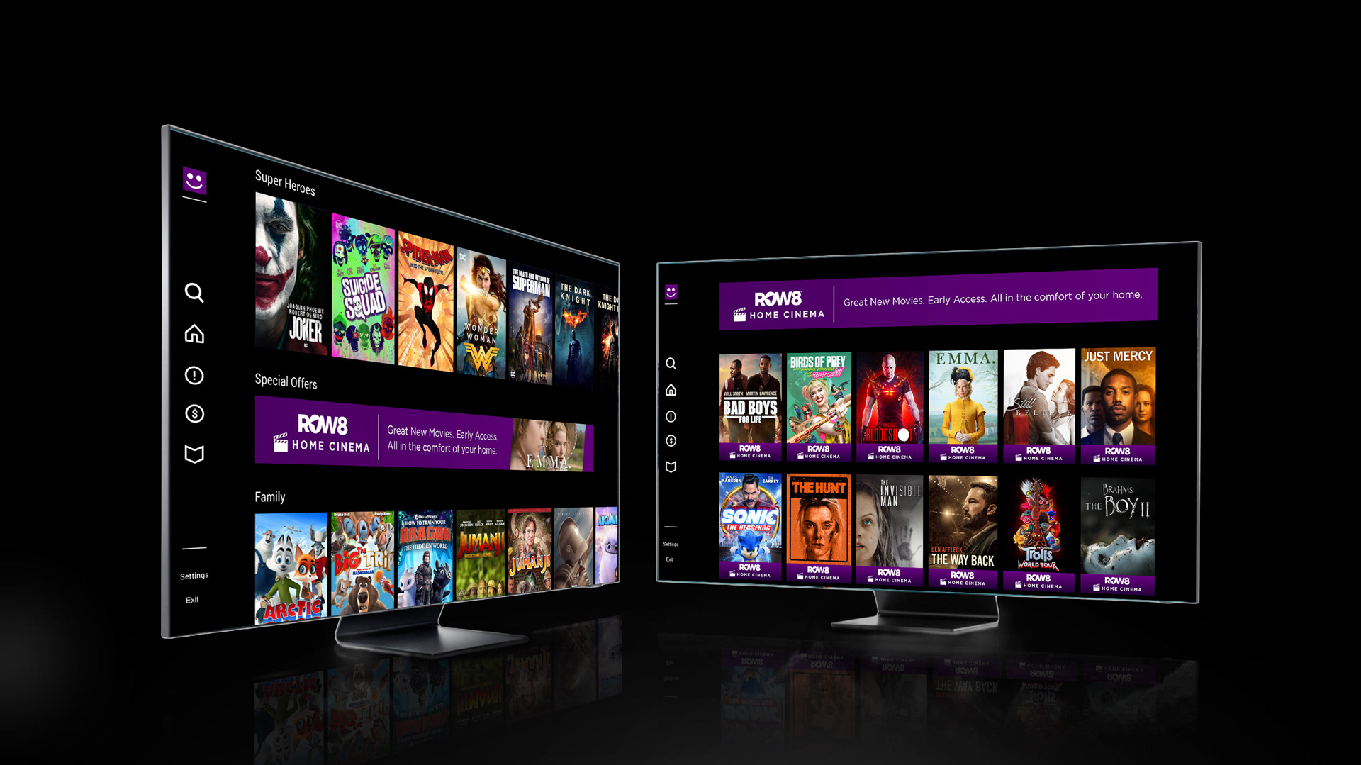
Special Offers
To present more value to users such as Mark, special offer banners were placed in between swim lanes to break up content and create contrast. In this example, "ROW8 Home Cinema" presents early access to new movies at the comfort of your own home. Clicking this banner will take you to that offer page where you can enjoy all the movies currently active in that offer. The "$" icon on the navigation bar would also take you to the latest offer page.
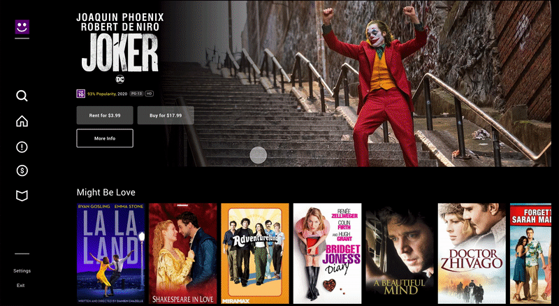
ROW8 Top 10
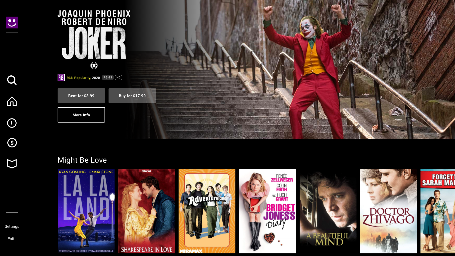
Having a large library of movies, a movie app should be able to recommend what is trending and popular for users as a curated list. Some users liked the idea of these recommendations to ease their search of what to watch next.
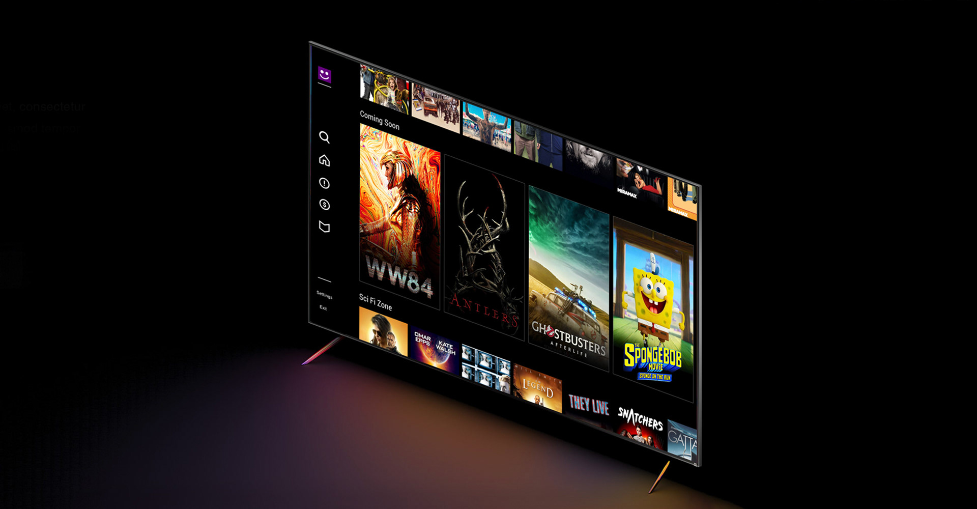
Coming Soon
Big-hit movies that were coming soon to the app had a dedicated swim lane where users can watch trailers without having to go to another page.
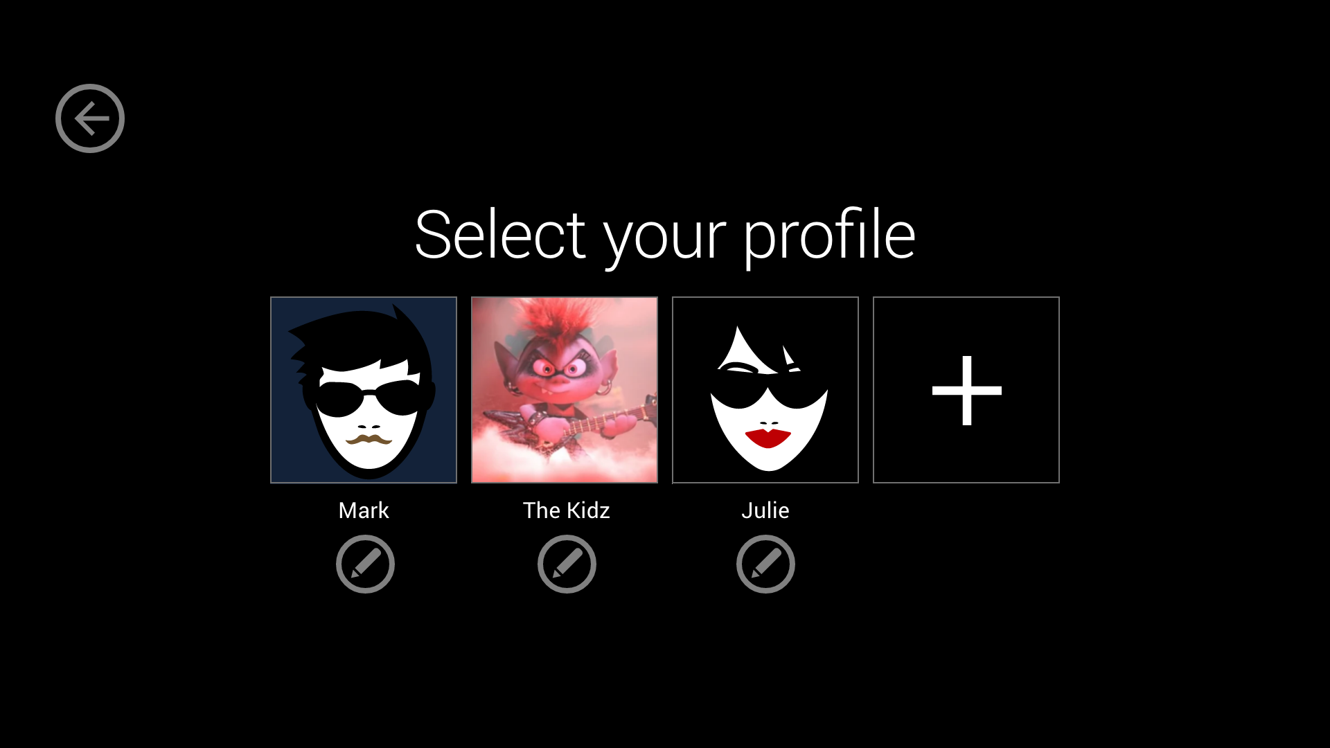
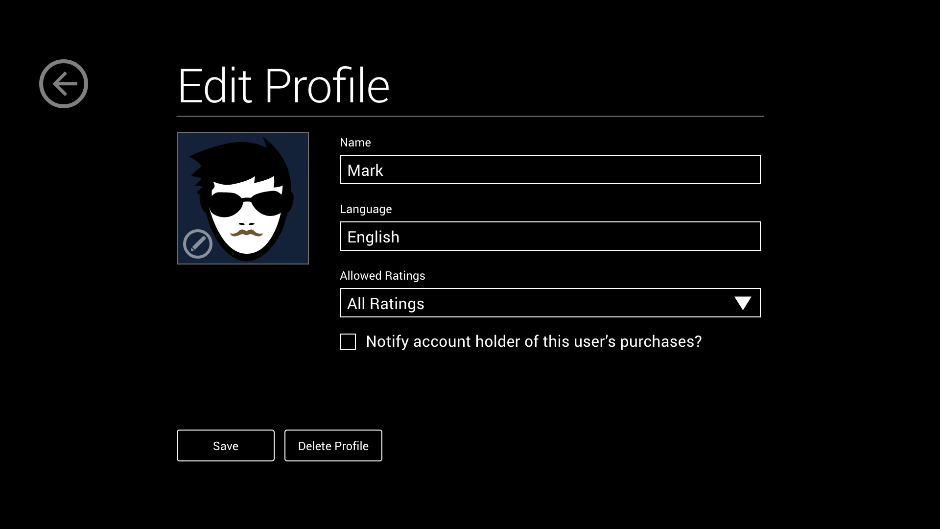
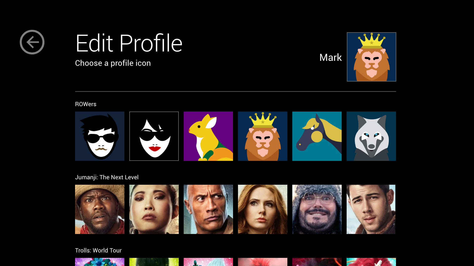
Edit Profile
Custom profiles were a requirement in this design to engage better with families. Accountholders had options such as setting certain movie ratings to their kids' profile and notifications when movies were purchased. Along with the ROW8 profile icons, users also had the choice to choose from characters from their favorite movies to provide a better experience.
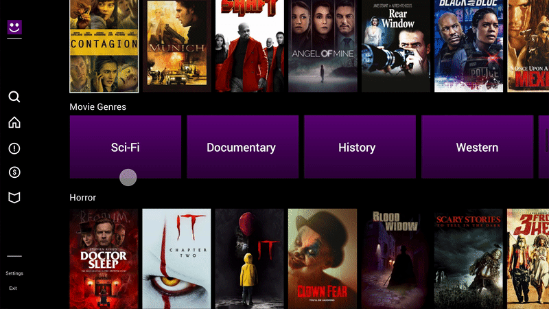
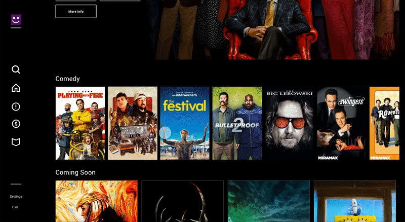
Movie Genres
This swim lane was created to provide easier navigation when searching for movies. The user could select a genre and be directed to those types of movies as alternative to the search button in the navigation bar.