Before
One of the main frustrations with the old design was that the main navigation bar was taken away as you were sent to a whole new page. This meant users could not go into other areas without having to click the Makita®.
Another frustration was the cumbersome amount of data that did not efficiently explain each category.
After
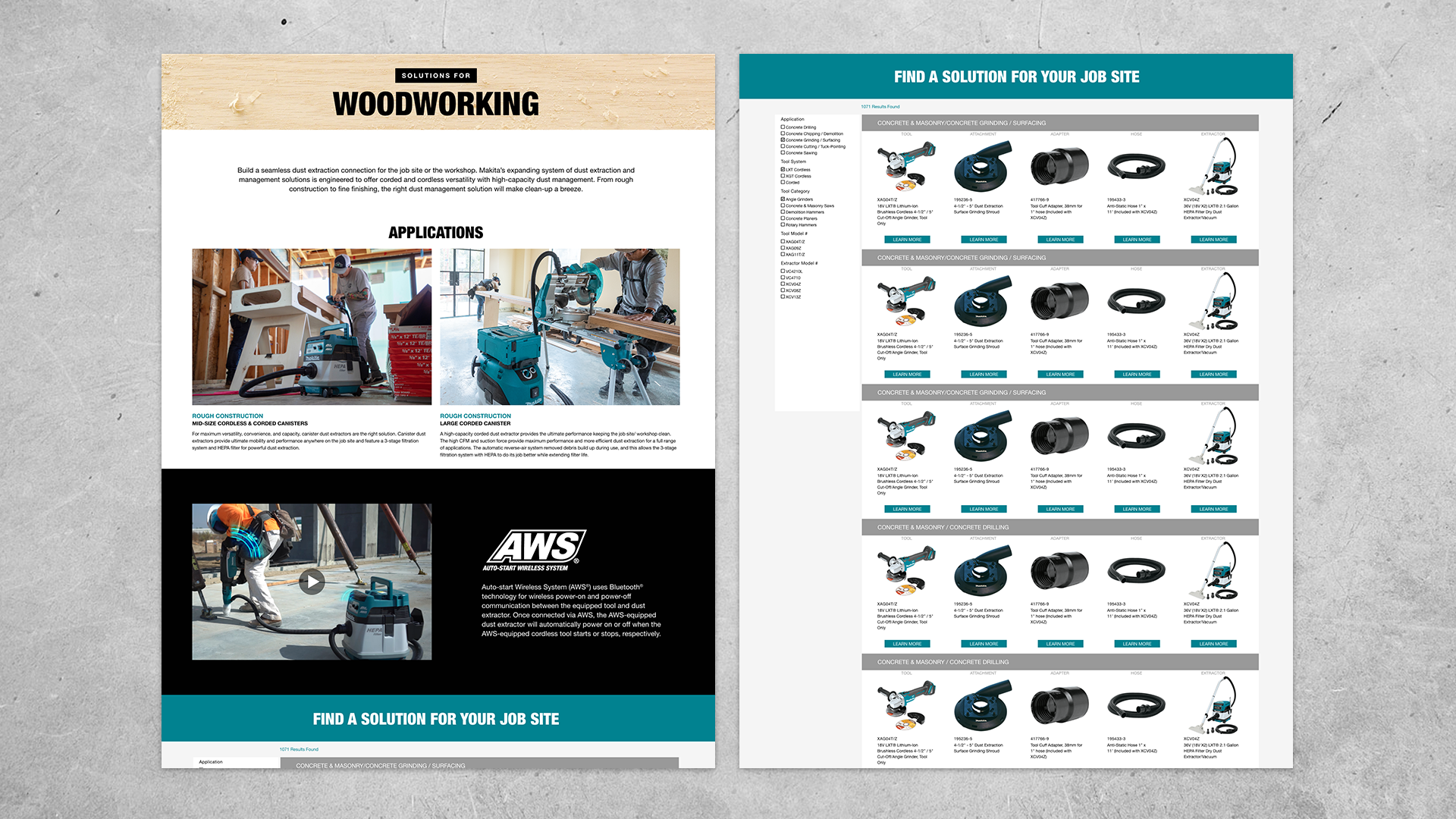
To successfully categorize each dust management section the entire page was reorganized into four sections; About, Concrete & Masonry, Drywall, and Woodworking. Users would now have better clarity on the different areas that Makita® offered applications for. The main About page contained all the information on AWS technology and provided an explanation to users as to how to connect their tools.
Tabs
To allow for easy navigation between the different categories, tabs were implemented to jump from page to page without having to leave the main site.
1. About
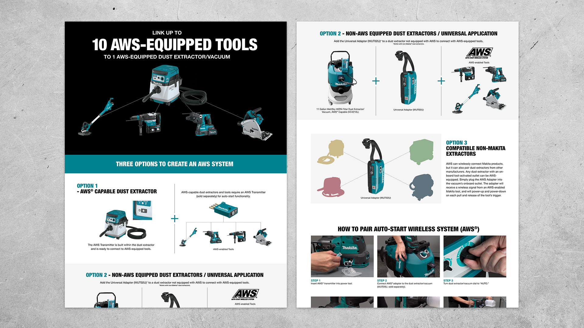
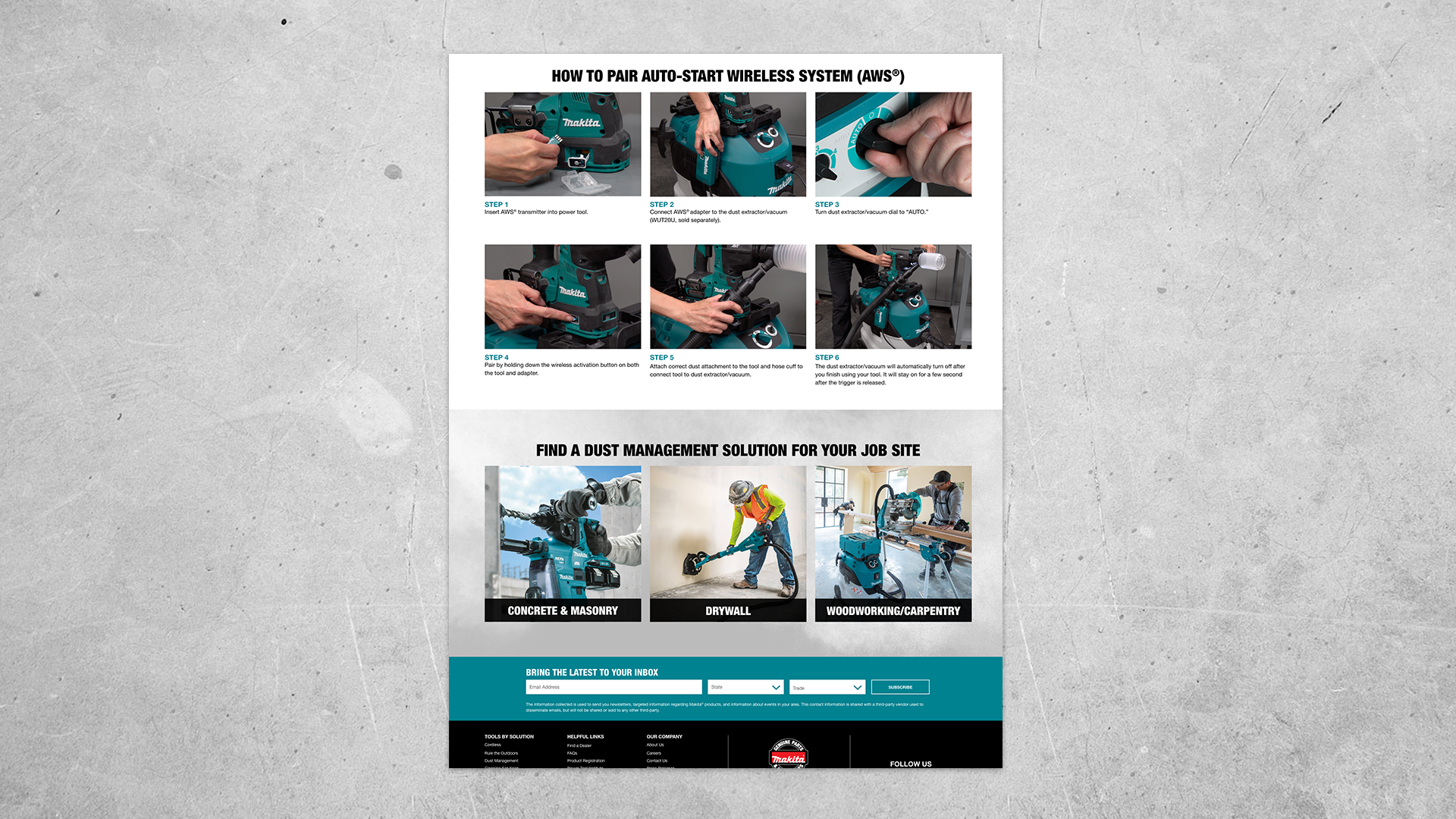
The main About page is where users landed when they clicked the Dust Management page in the navigation bar. This page provided information on the dust management options available to customers, what AWS technology is, the three ways to create an AWS system, and how to successfully pair your tools using AWS.
Anchors
The About page was divided into four sections and anchors were used to allow the user to move around to the information they were looking for easier.
AWS Technology Video
To better explain Makita's® AWS technology, the old video was completed recreated with fresh new graphics and a better explanation of all that Makita had to offer with its tools. This provided more value to the page as it increased awareness to new customers and provided an overview of the benefits of having this technology in the work area.
Rollovers
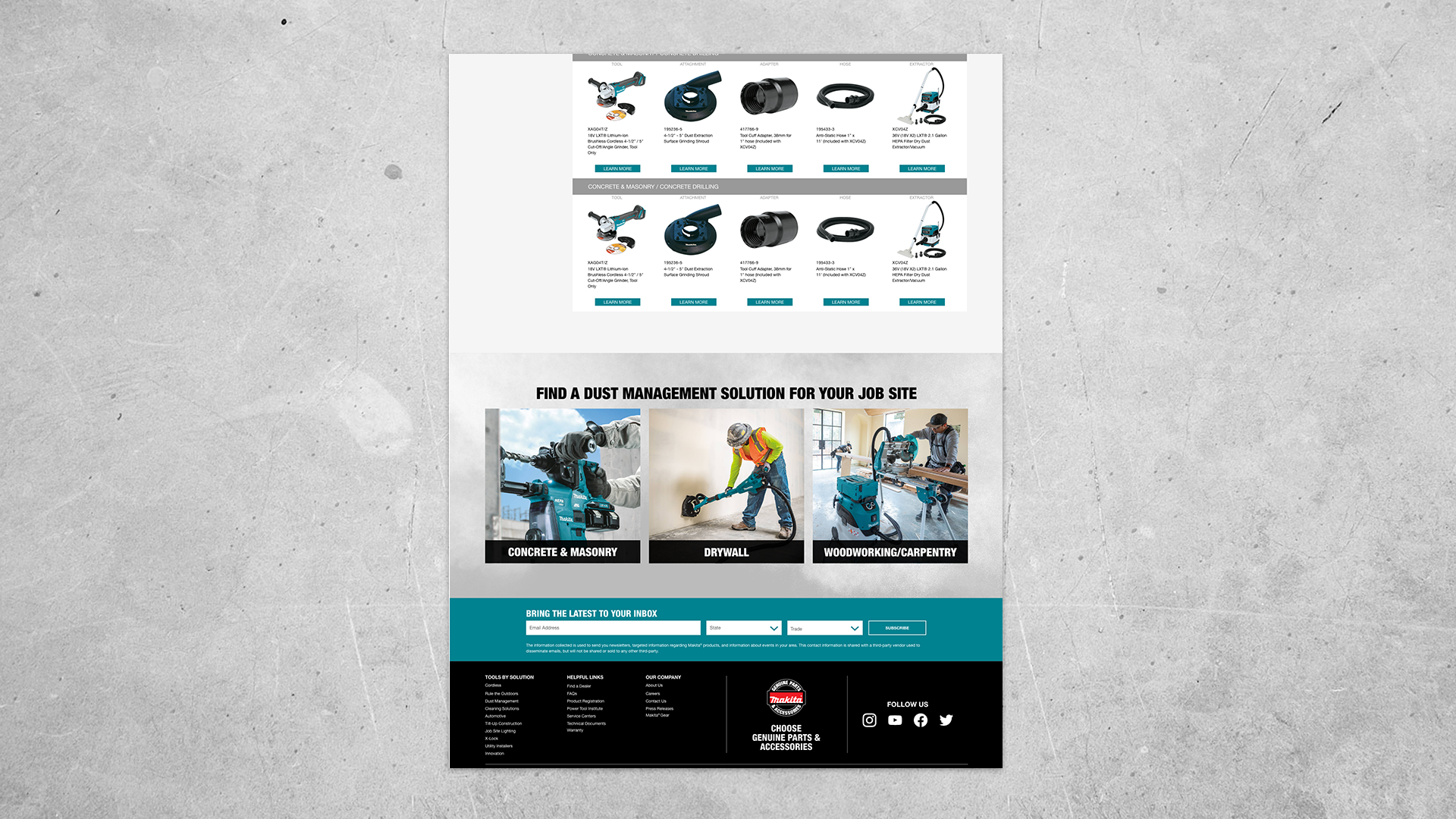
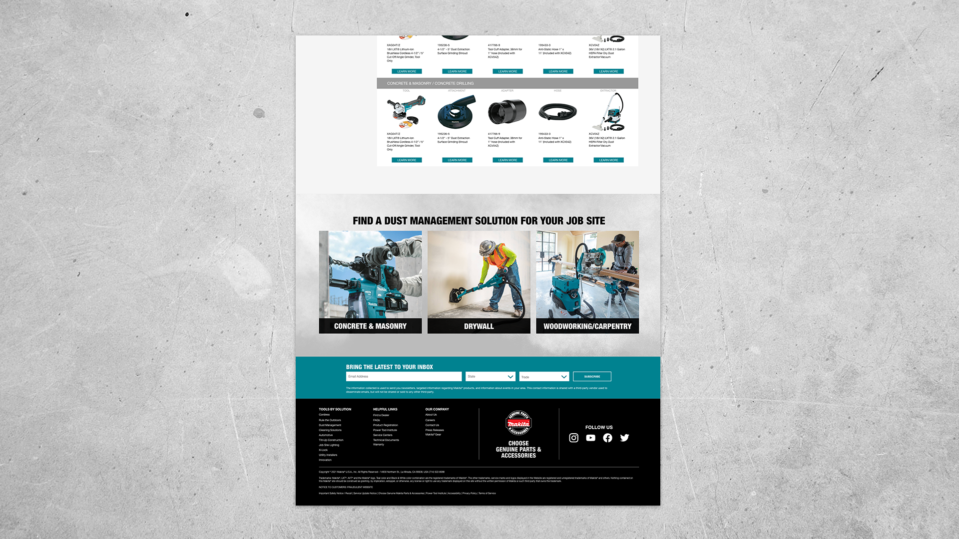
At the bottom of each page, a module was designed to display all the dust management solutions and allow for the user to continue into another category if needed.
2. Concrete & Masonry
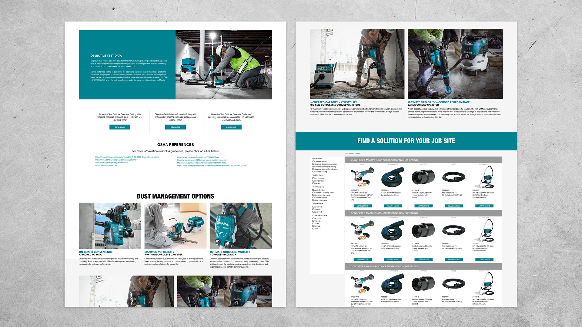
This page contained a large amount of OSHA information that customers needed to know. In order to make it more interesting to read, specific imagery was used to better communicate the messaging to customers.
3. Drywall
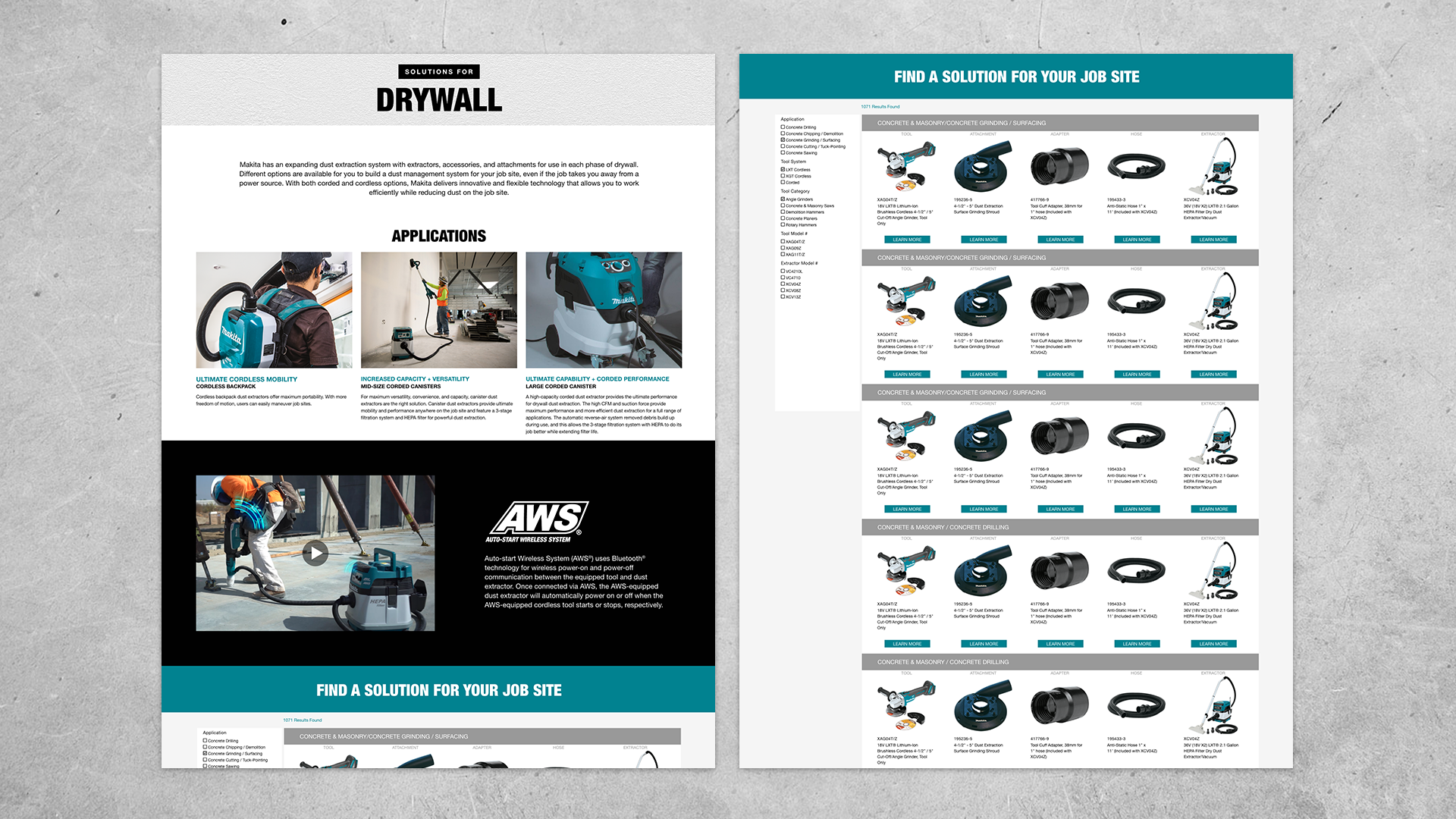
If a customer was searching for dust management solutions in the drywall area, this is where they would be directed. At the top, the different applications were presented followed by the AWS technology video to further explain the value in having this technology in their arsenal of tools.
4.Woodworking
Similar to the Drywall page, the Woodworking page presented customers with solutions in this specific work area. Applications solely meant for woodworking were displayed at top along with the AWS video. At the bottom of the page, a module was implemented for customers to begin searching for specific tools. This module also presented filters so that customers could narrow down their search faster.
