Landing Page Design
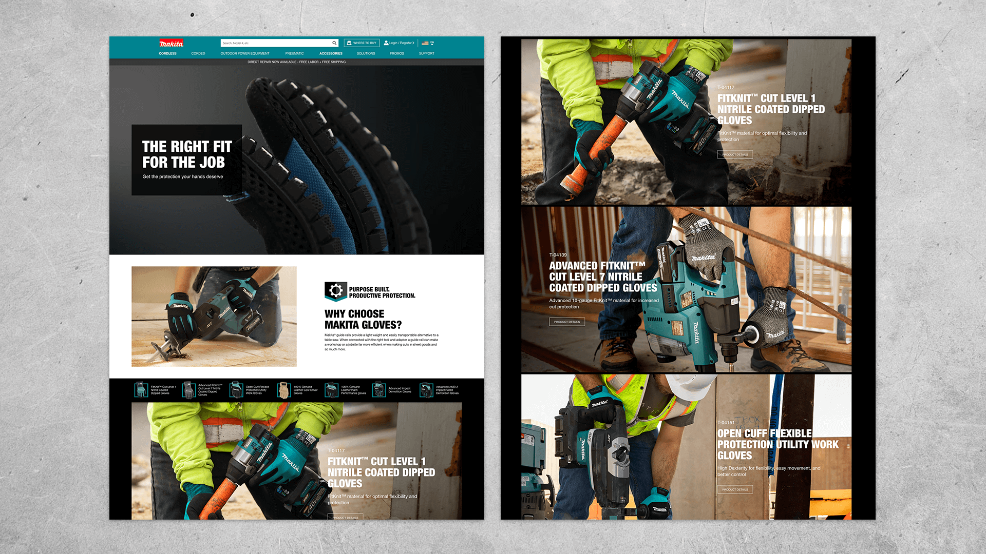
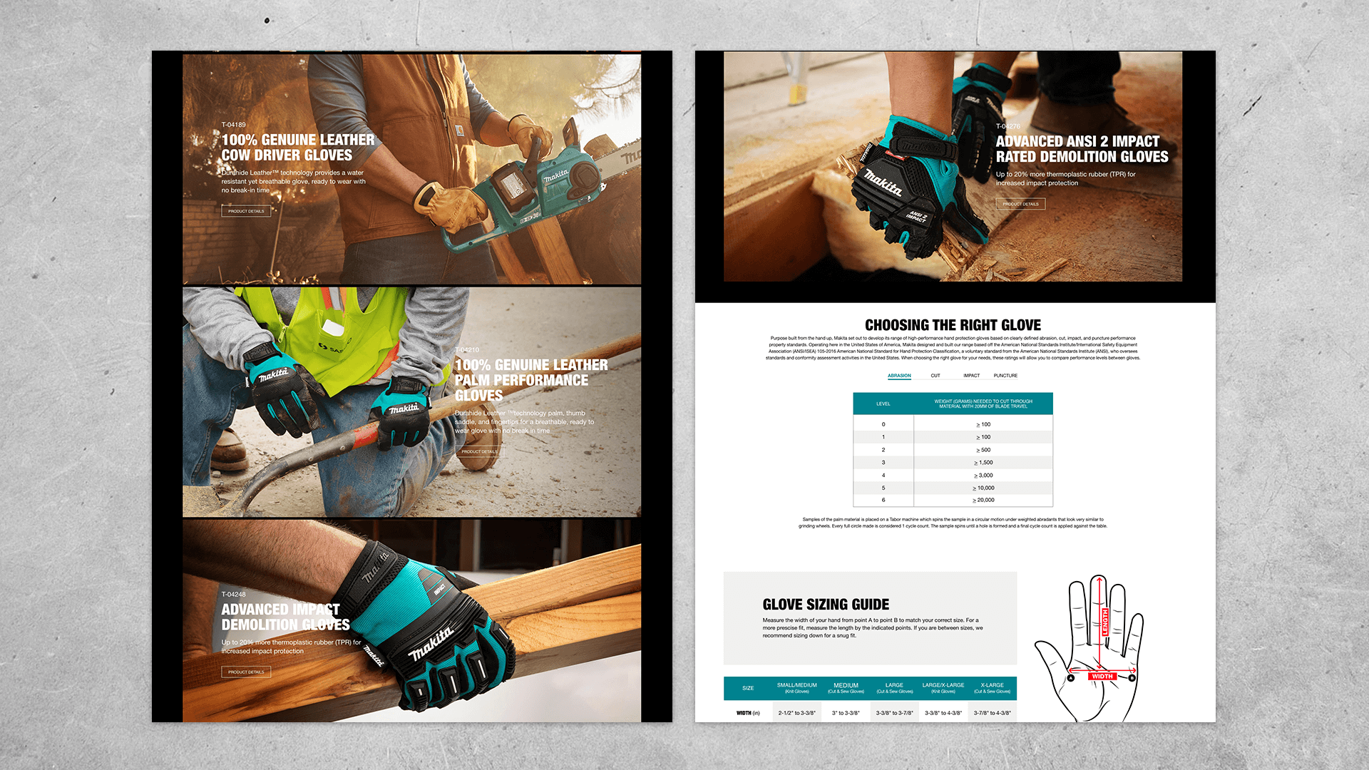
In order to show the gloves in detail, large images were used with carefully written copy to better tell the story. As each of the gloves offered a different level of protection, the goal of the photography was also to show the environment the gloves could be used in.
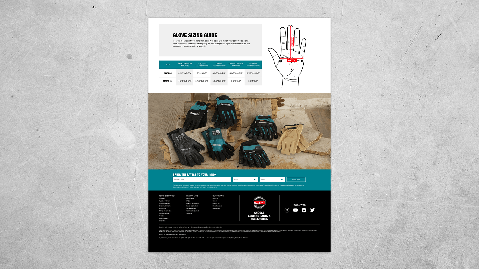
Simple modules were also used to break down otherwise complicated information such as gloves safety. A new fitting chart also had to be designed to better present content from the manufacturer.
Anchor Effect
At the top of the page all seven gloves were presented to make the user aware of the variety offered. Clicking one of the gloves would scroll down to that glove image where the product details CTA was visible and the user could get more information.
Tabs
In order to better educate users on how to choose the right glove, a tab function was used to present the four kinds of protection. A simple click would show each designated chart.
Mobile Design
Simple modules were used in the mobile design to maximize imagery and keep content straightforward. As the user scrolled down, the information was given plenty of space so that reading would not become tiresome.
Safety Chart Scroll Function
In order to solve the issue of presenting large charts, such as the one used in the "Cut" category, a horizontal scroll function was used to present the information in a simple manner.
Sizing Chart Scroll Function
Just as the safety chart required displaying large charts, the horizontal scroll feature was repeated to show the glove sizing chart.
Click the button below to see the live page.
