Inspiration Board
This inspiration board was put together to see current logo trends and possible logo directions. Industry styles included simplified shapes and instantly legible fonts.
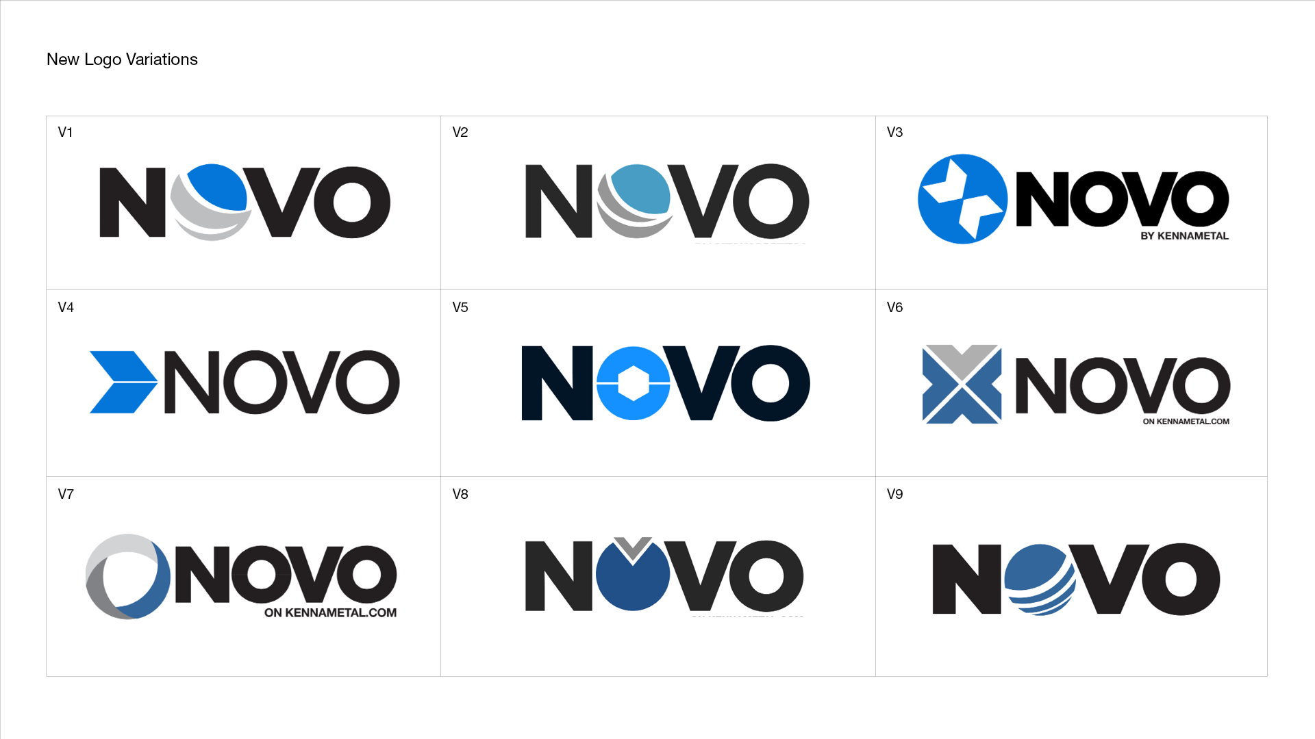
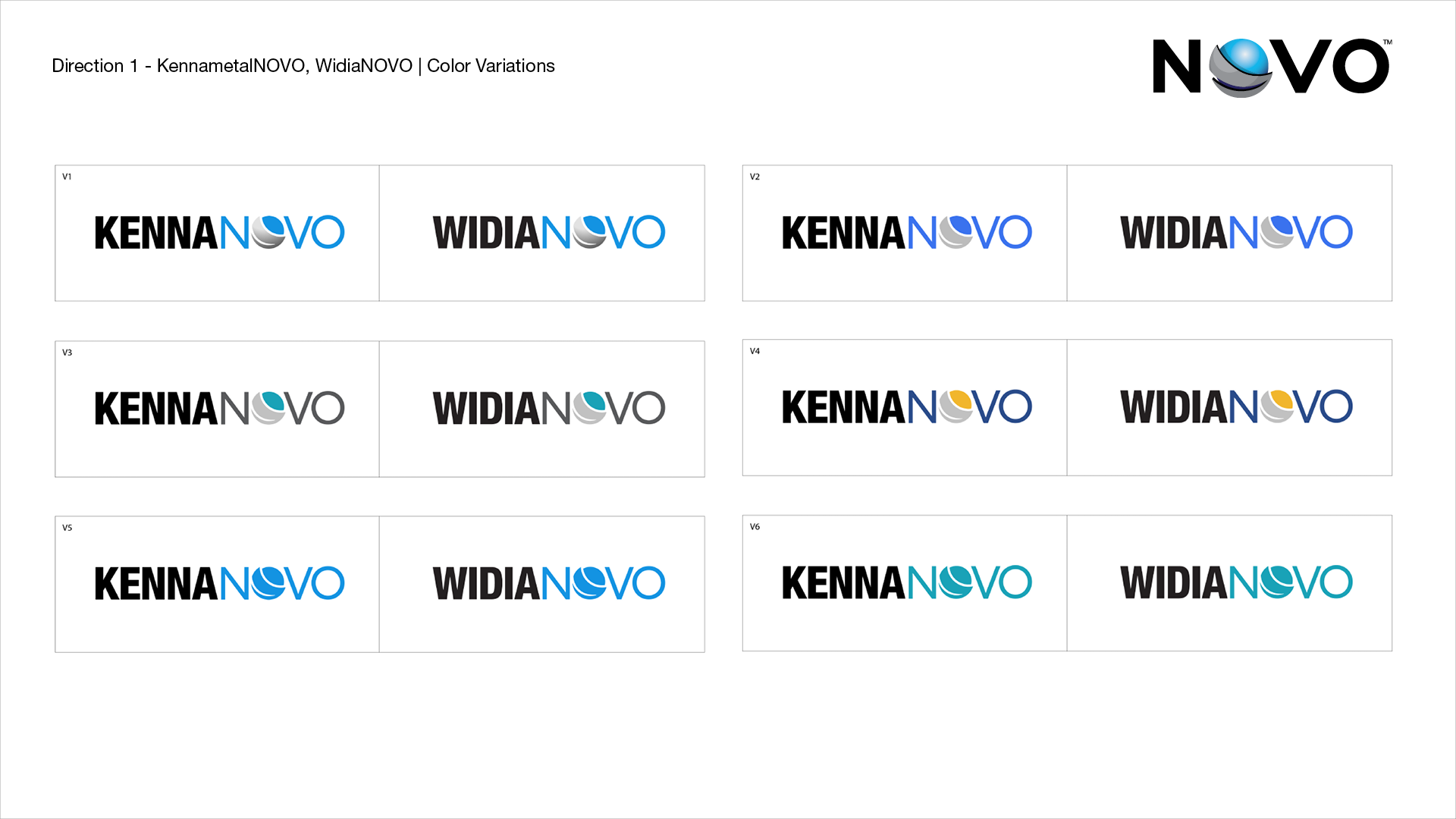
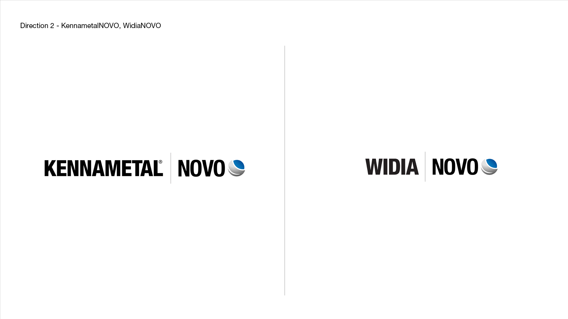
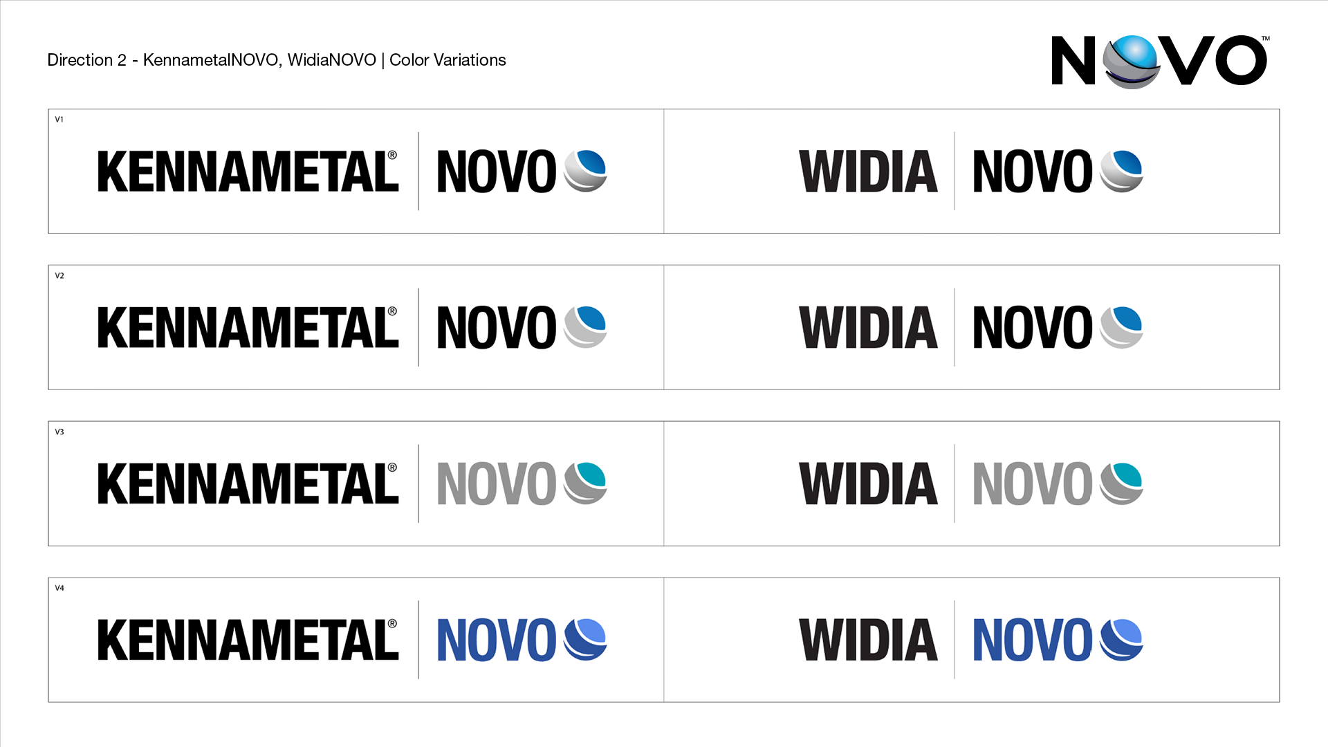
New Logo Variations
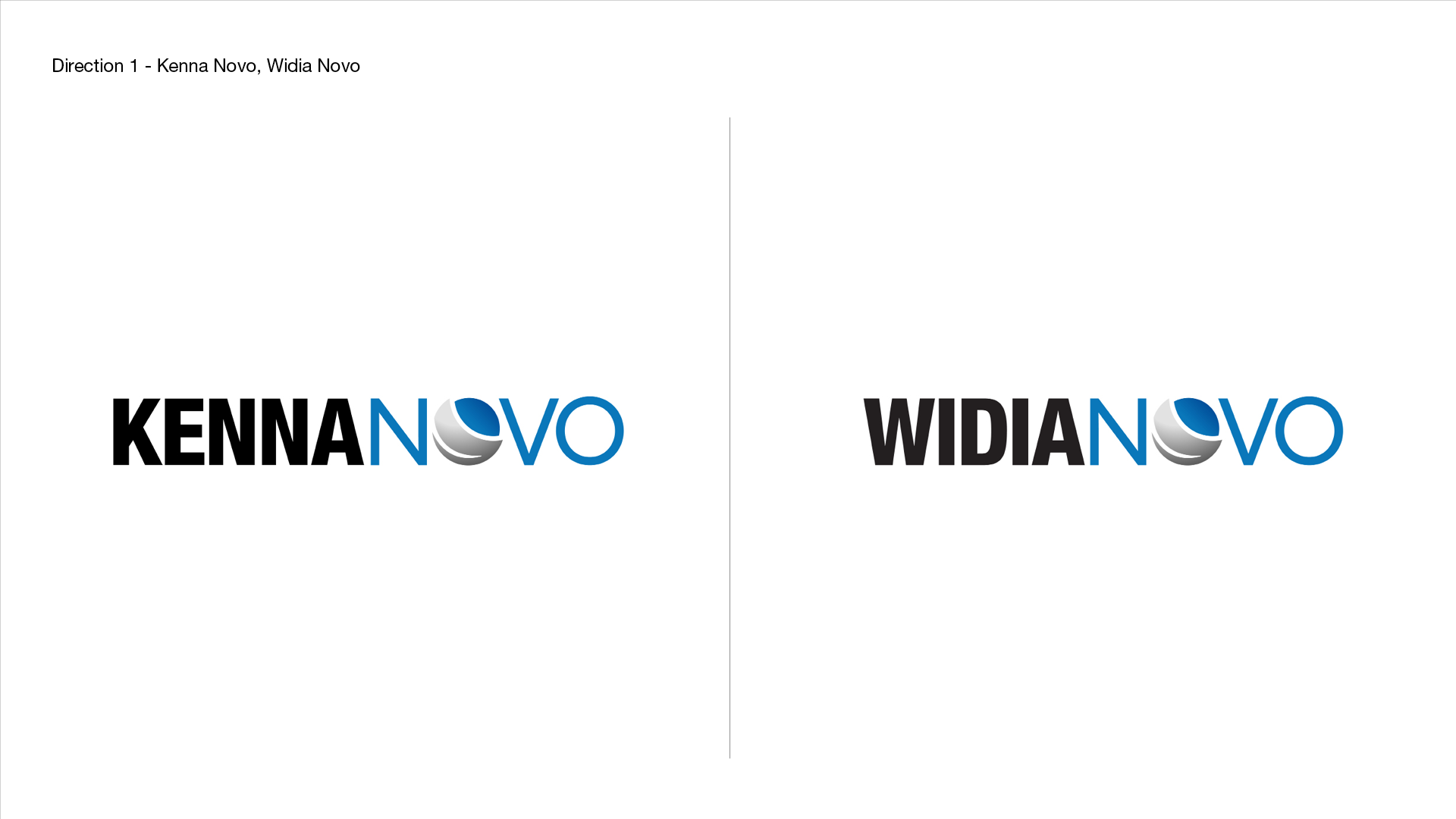
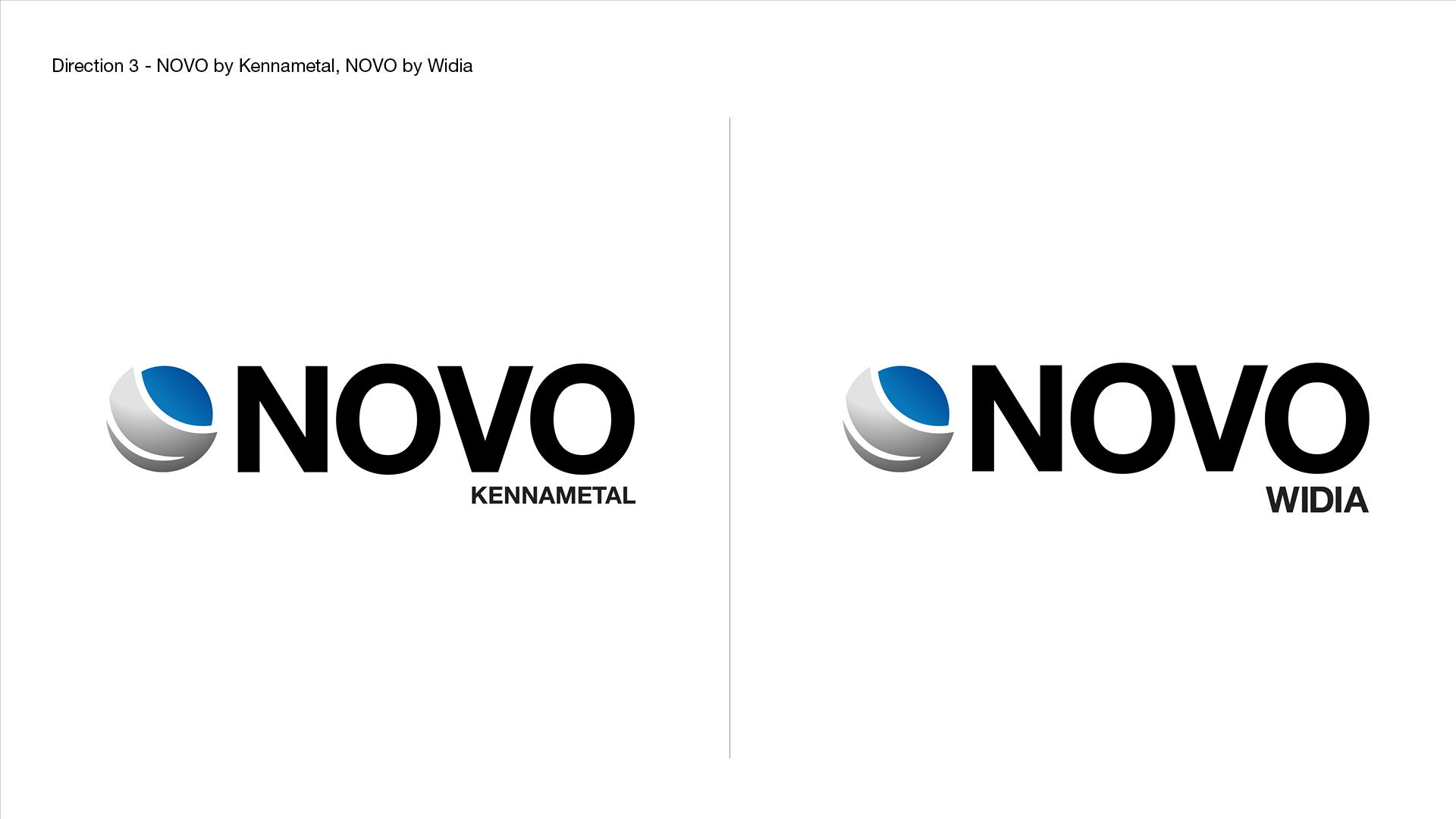
New logo variations were explored to provide fresh ideas along with a more simplified version of the current logo. After stakeholder feedback, three different directions were derived. Each direction tested a different treatment using the Kennametal and WIDIA brands.


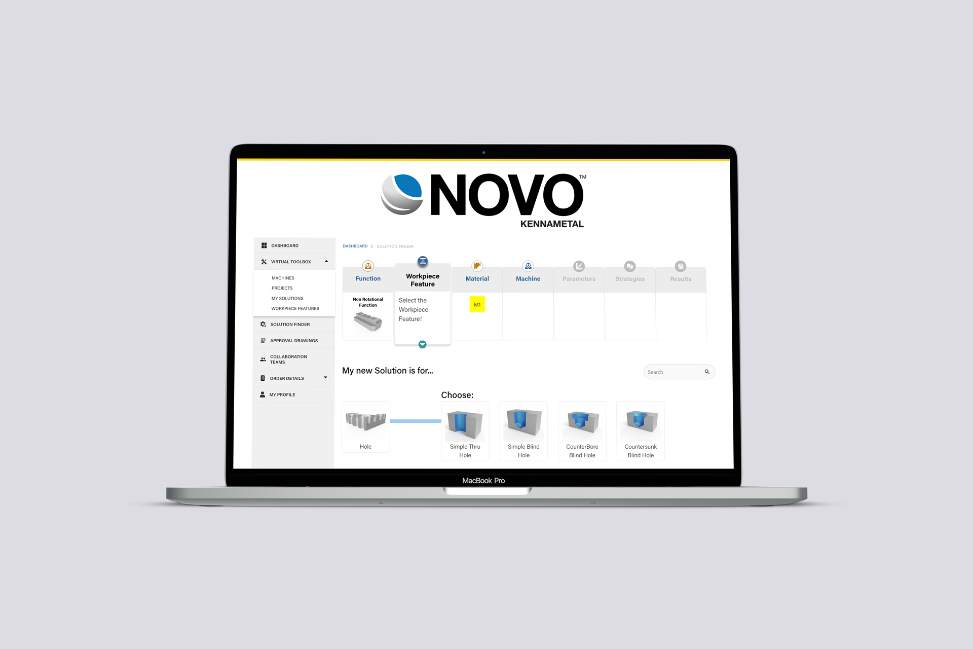
Final Logo
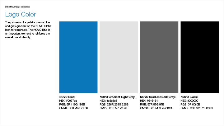
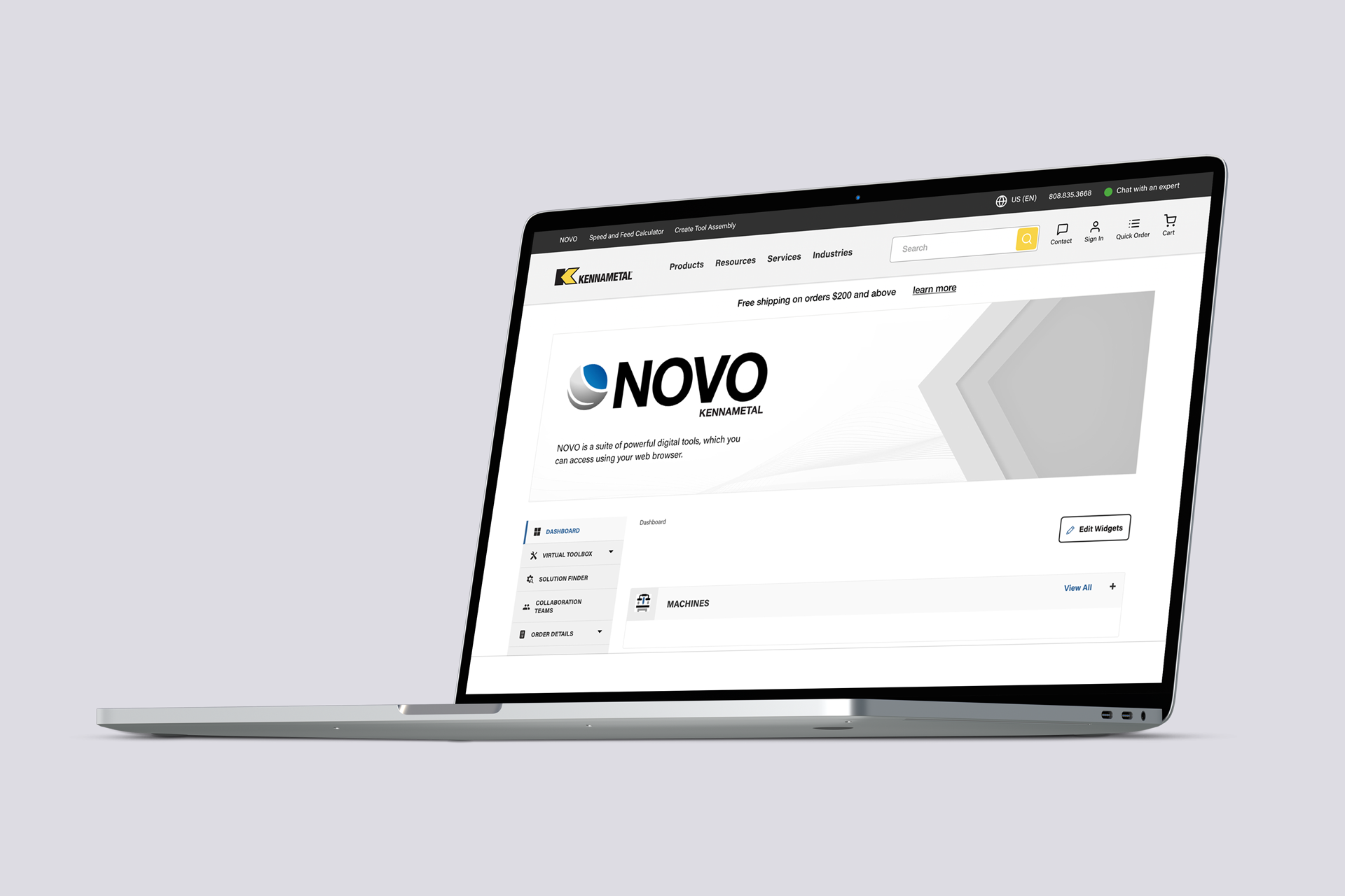
Ultimately direction three was chosen as the most efficient and relatable to the audience. The NOVO icon used a blue and grey tone from the original logo and the type kerning was closed in to create unity in the logo overall. Different logo sizes were also tested in order to keep maximum visibility across different platforms.
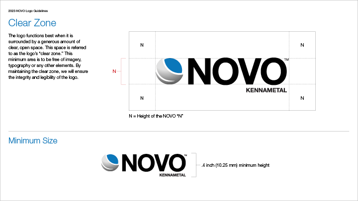
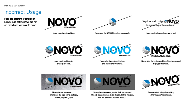
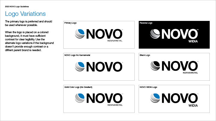
Logo Guidelines
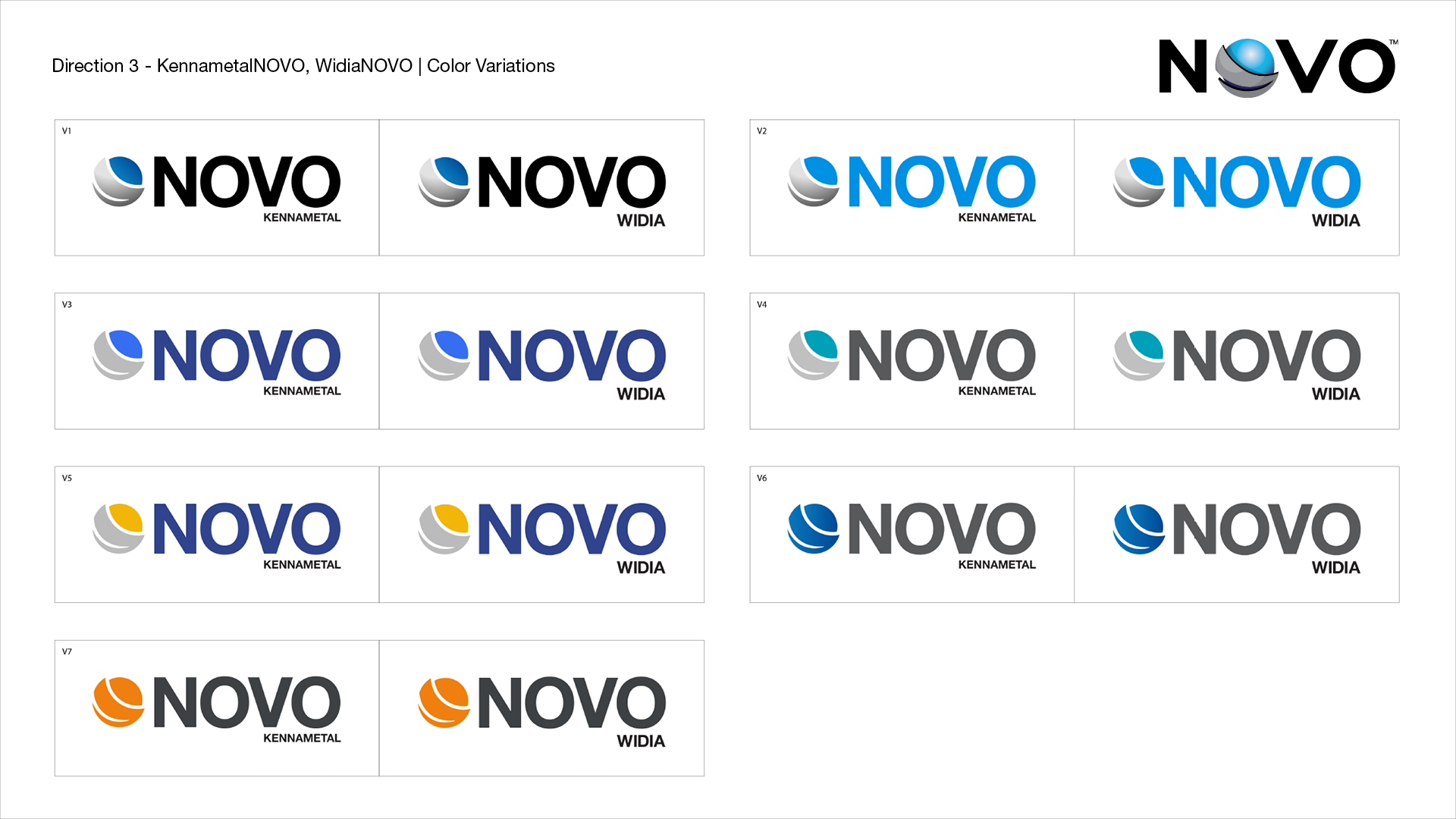
A fresh set of logo guidelines were created to keep brand consistency and directions for use across different digital platforms. With a gradient being used on the logo icon, different variations were designed to accomodate settings where a gradient might not work. Colors were carefully selected to keep a close relationship to the main Kennametal brand and to keep a modern and an innovative appearance.