This conceptual redesign of the website takes it to another level by focusing on making the best out of the high quality photography that is part of the Automobile ethos. The layout of the homepage presents readers with plenty of articles to choose from with bold headlines and categories such as Now Trending and Recent News as categories that would enhance SEO. Although news articles would take up most of the placement on the page, a section for feature articles has also been designated with a larger image to offer readers something different to read as they scroll down.
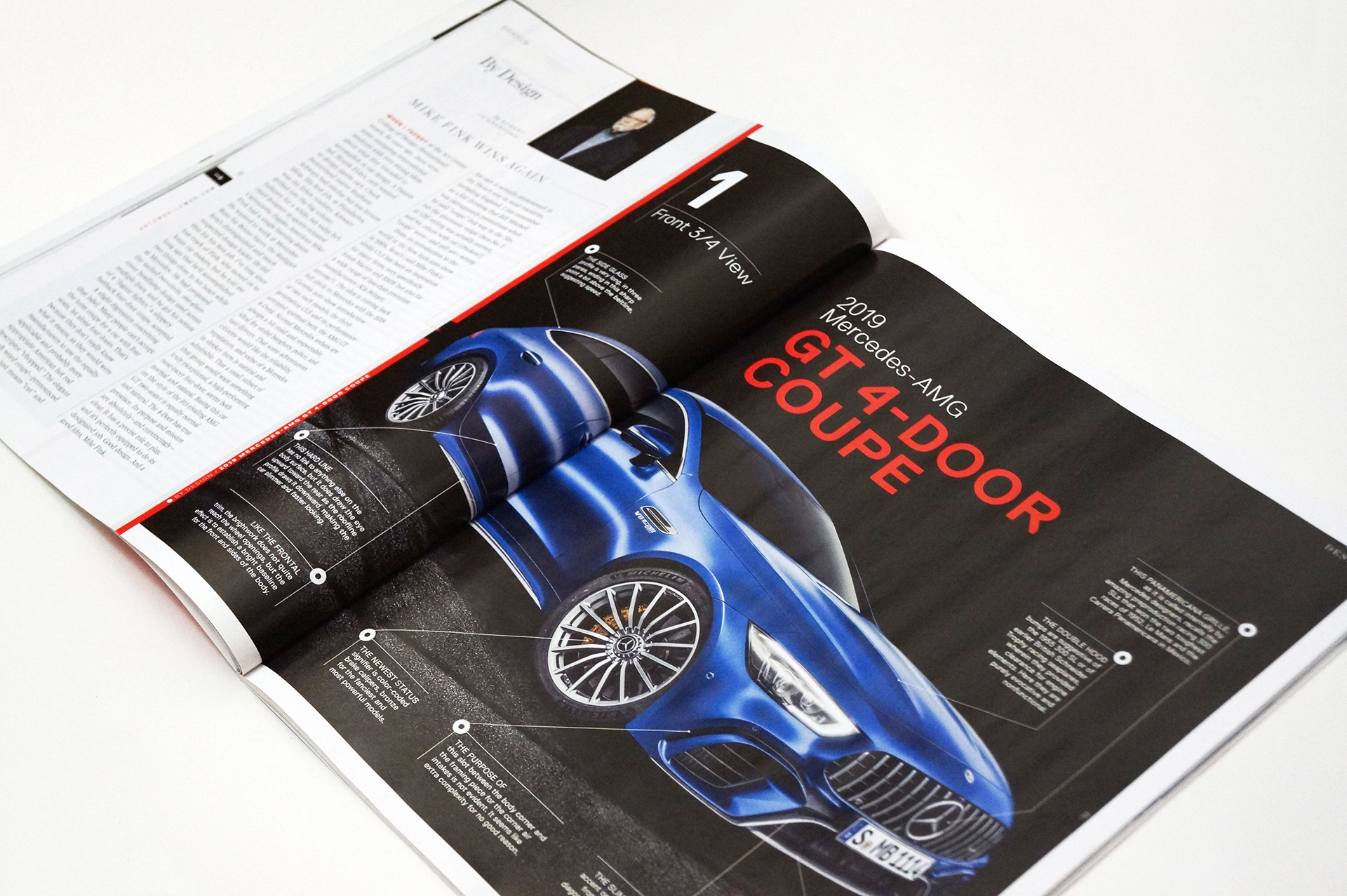
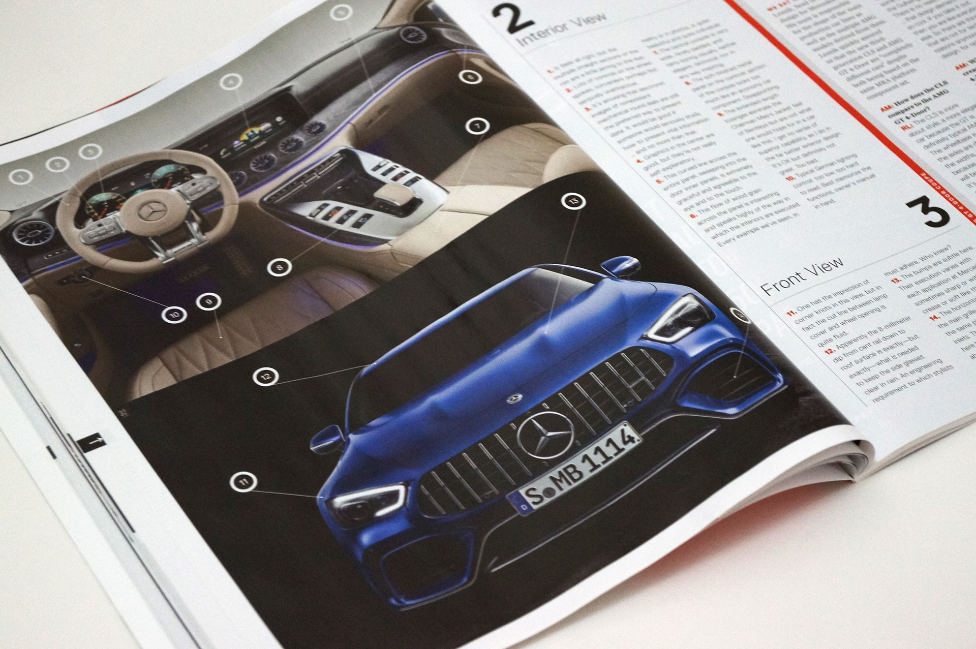
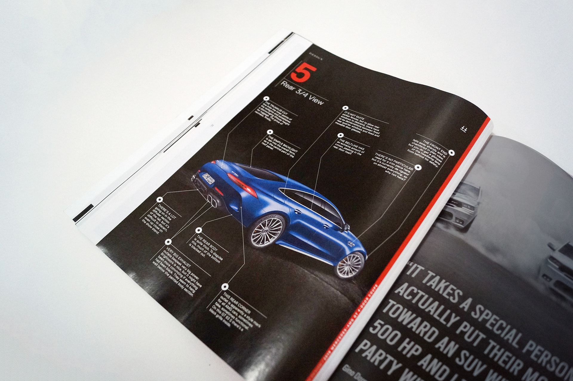
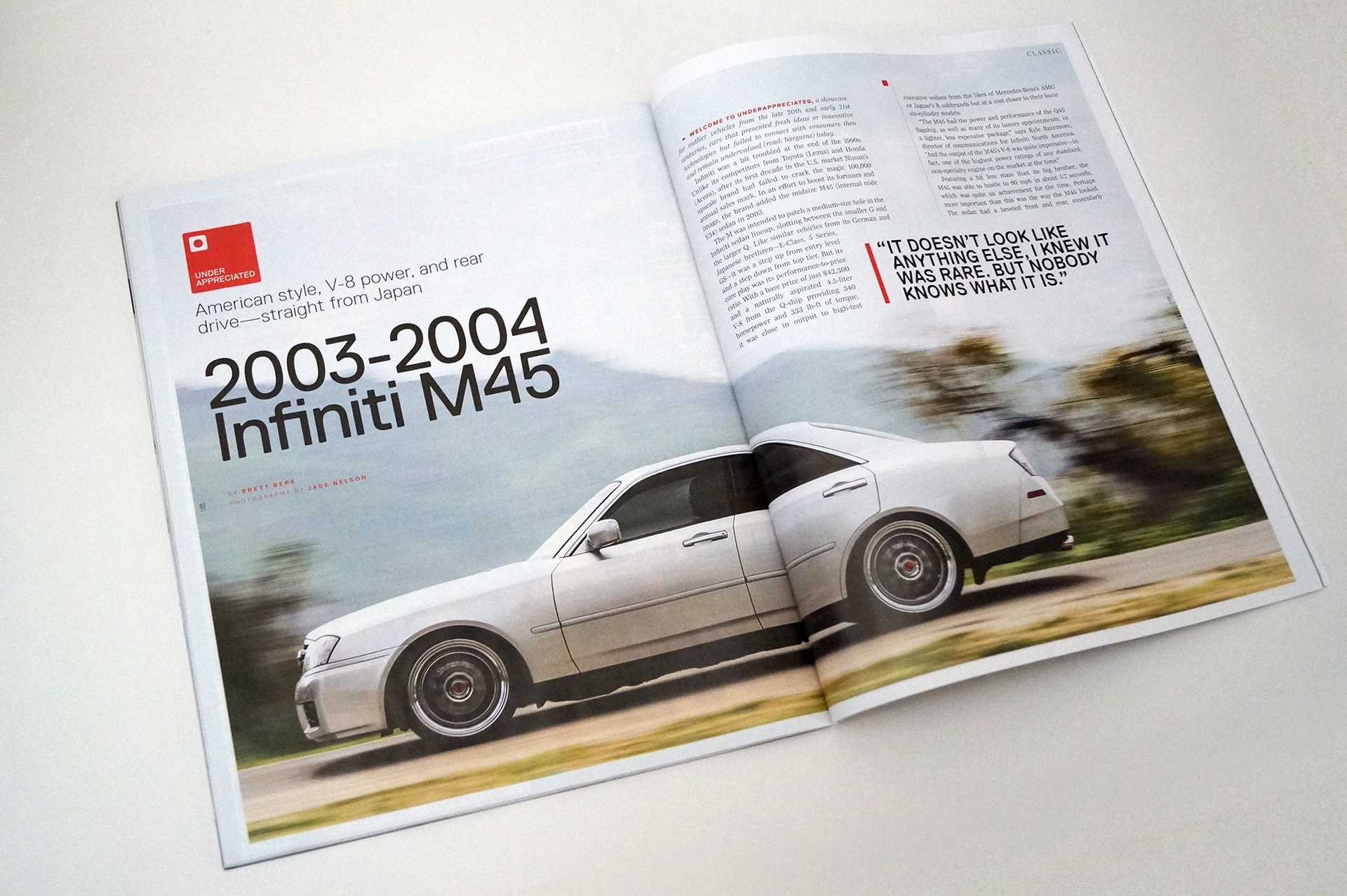
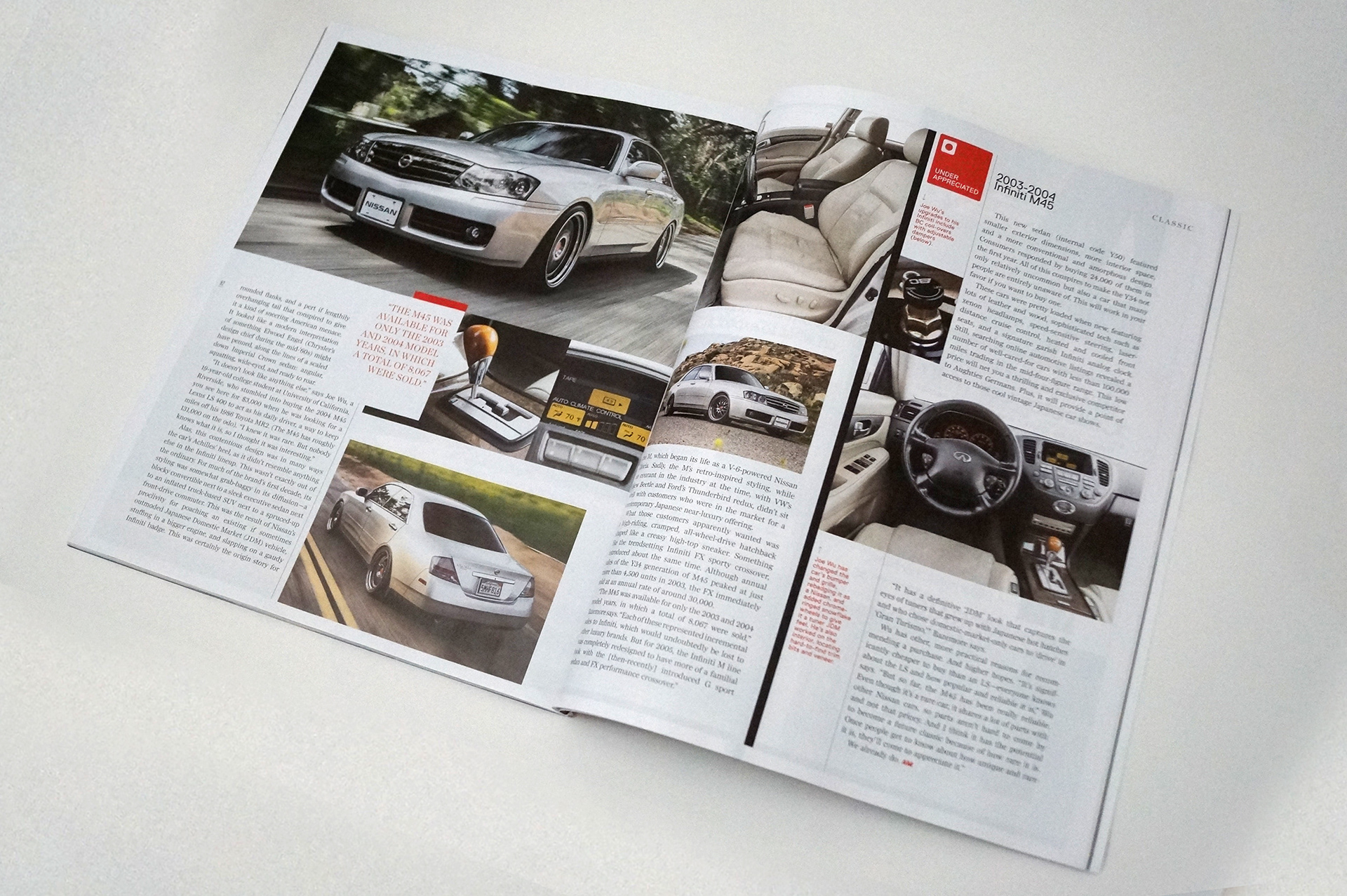
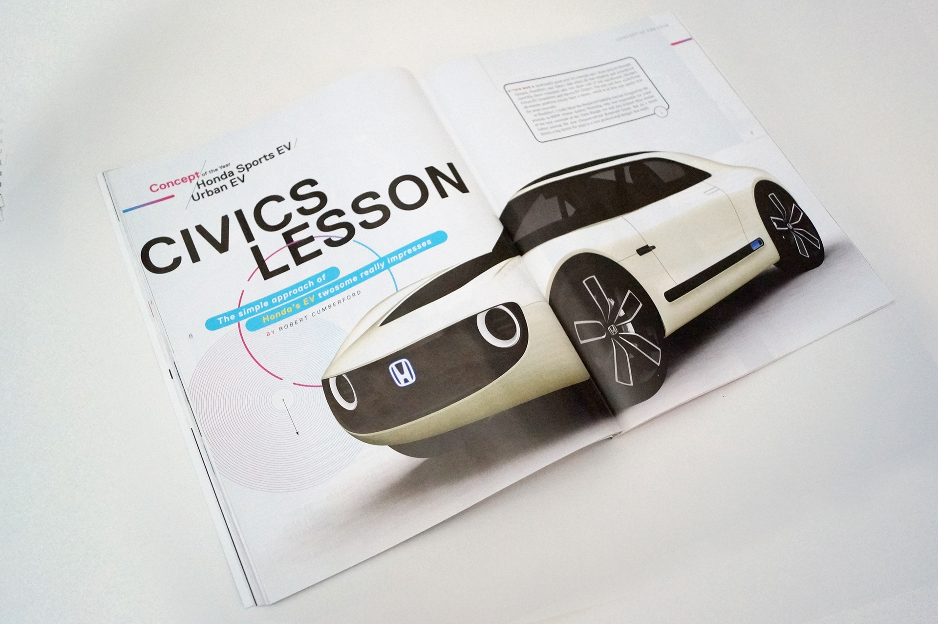
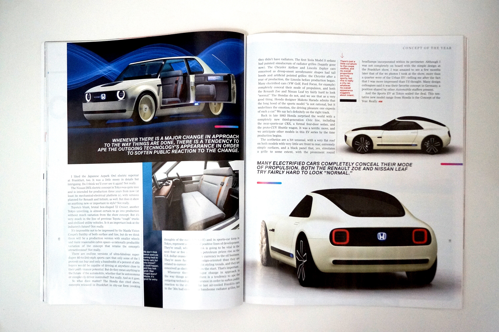
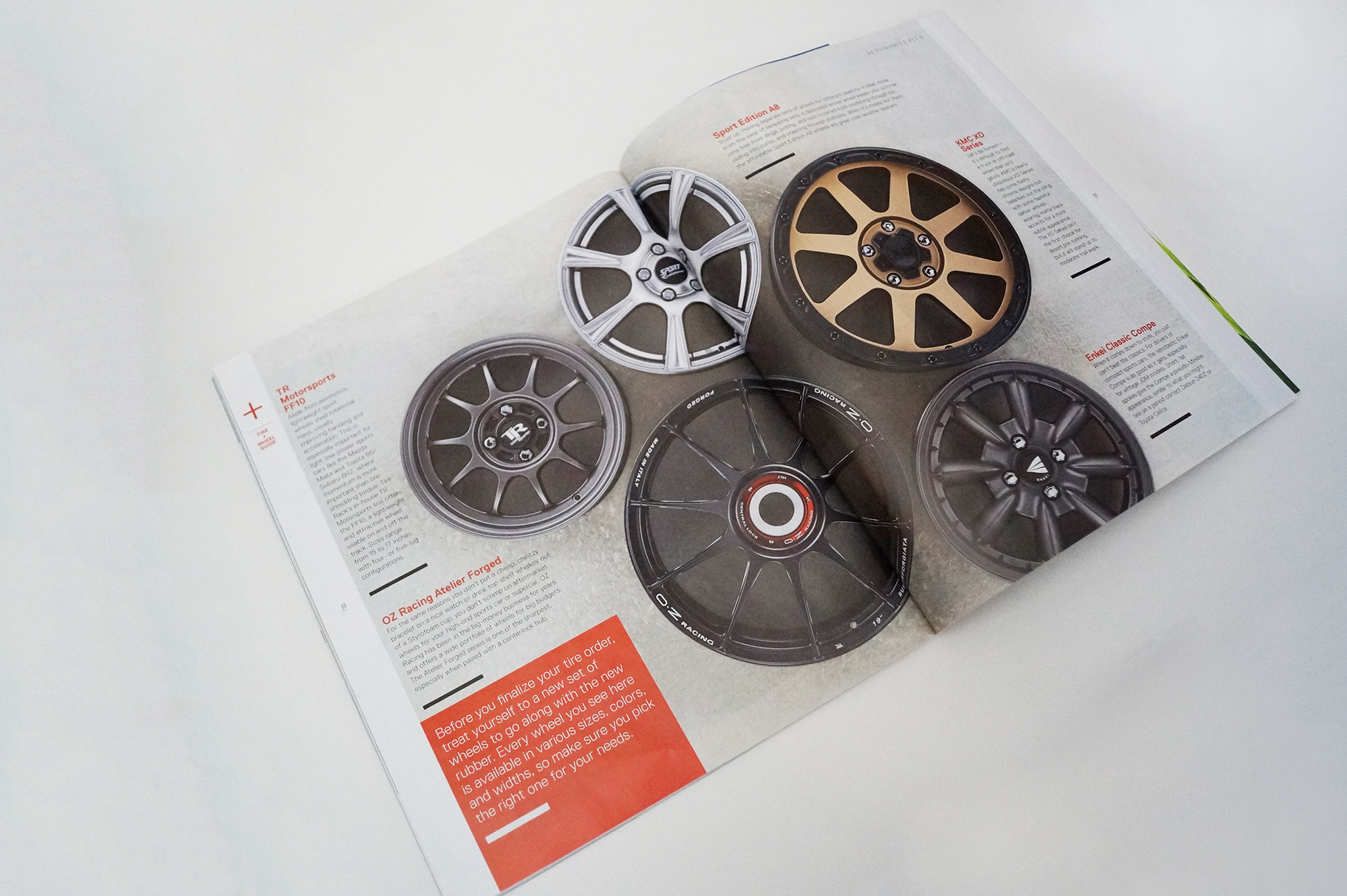
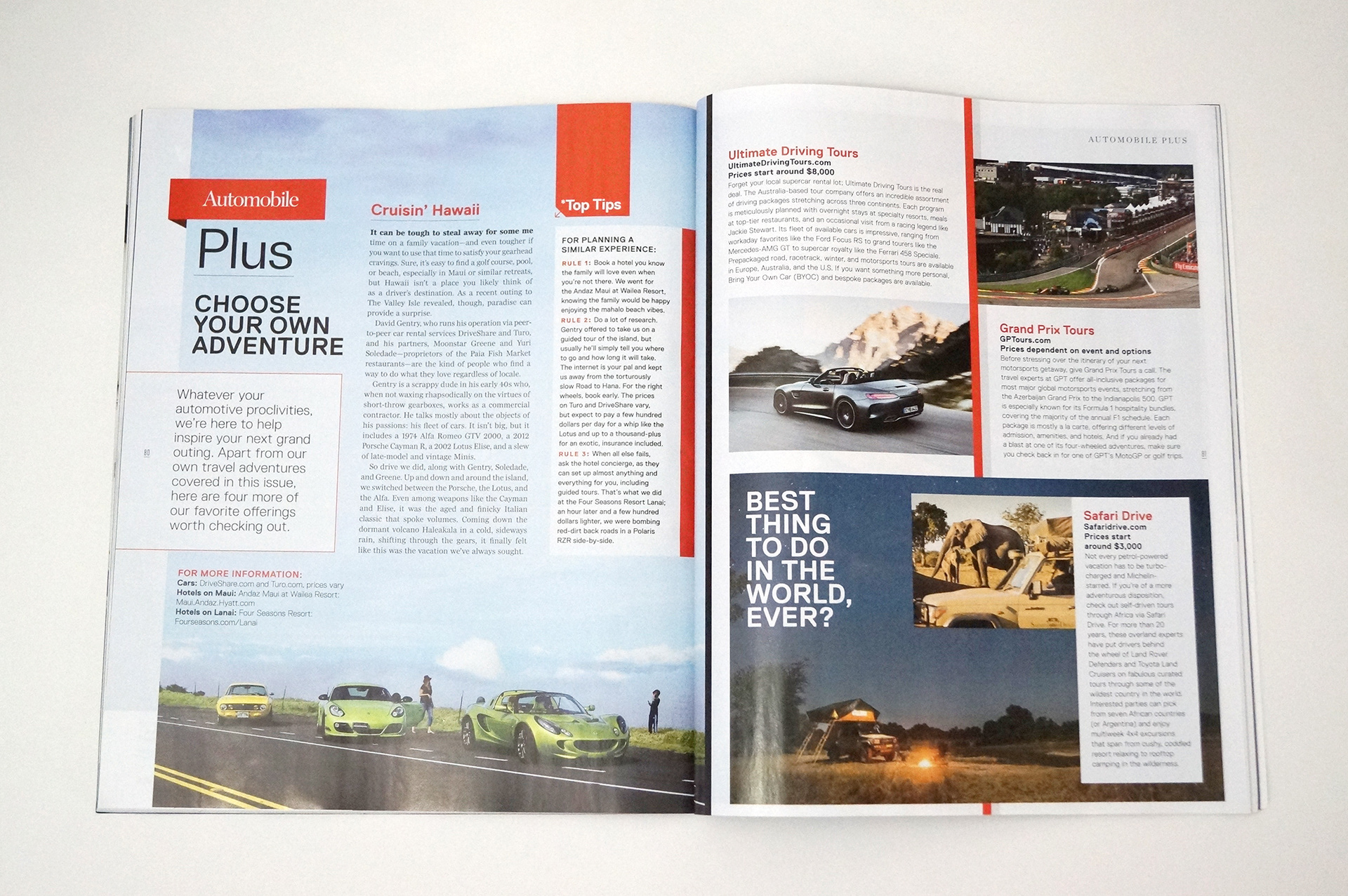
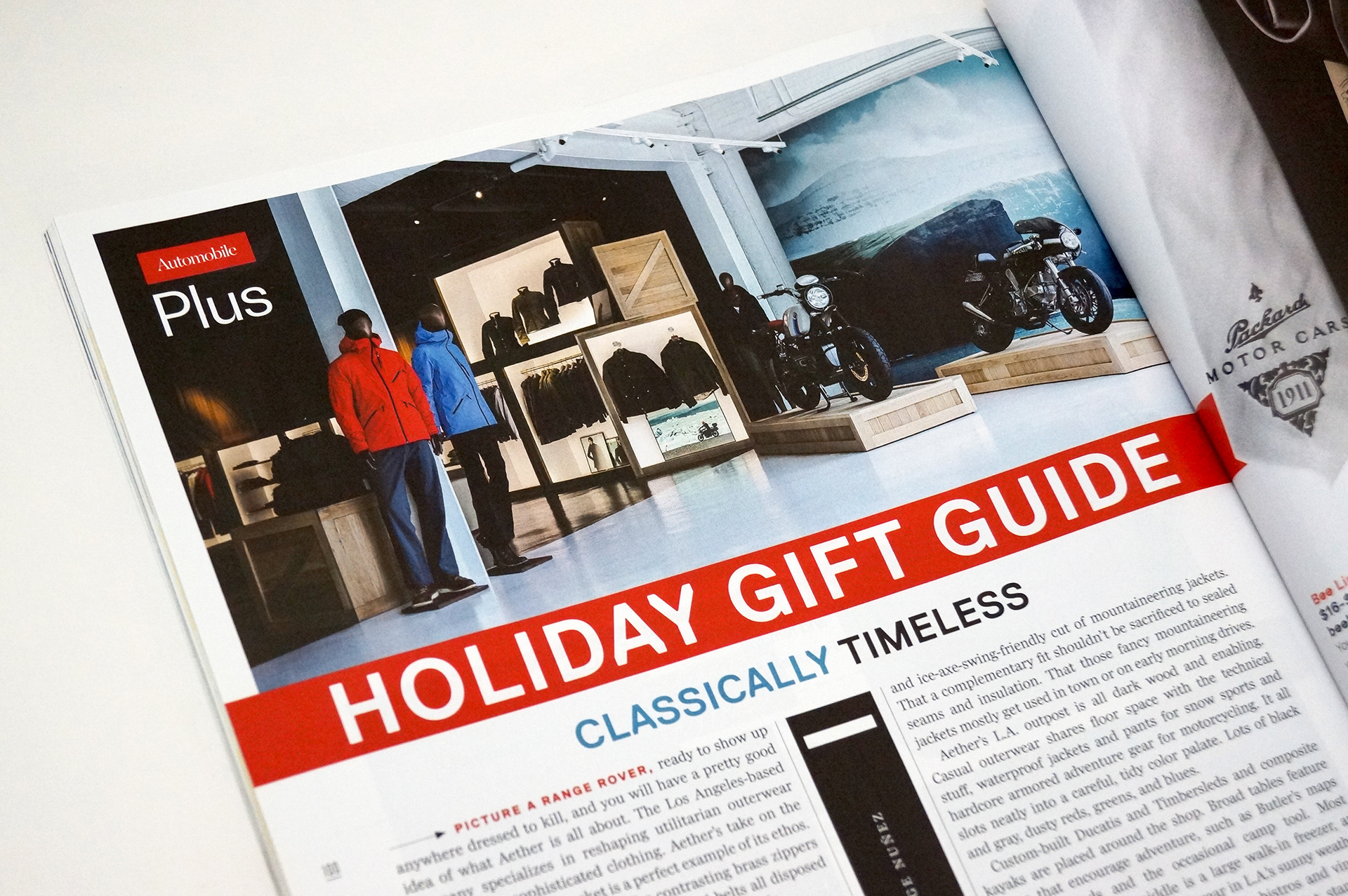
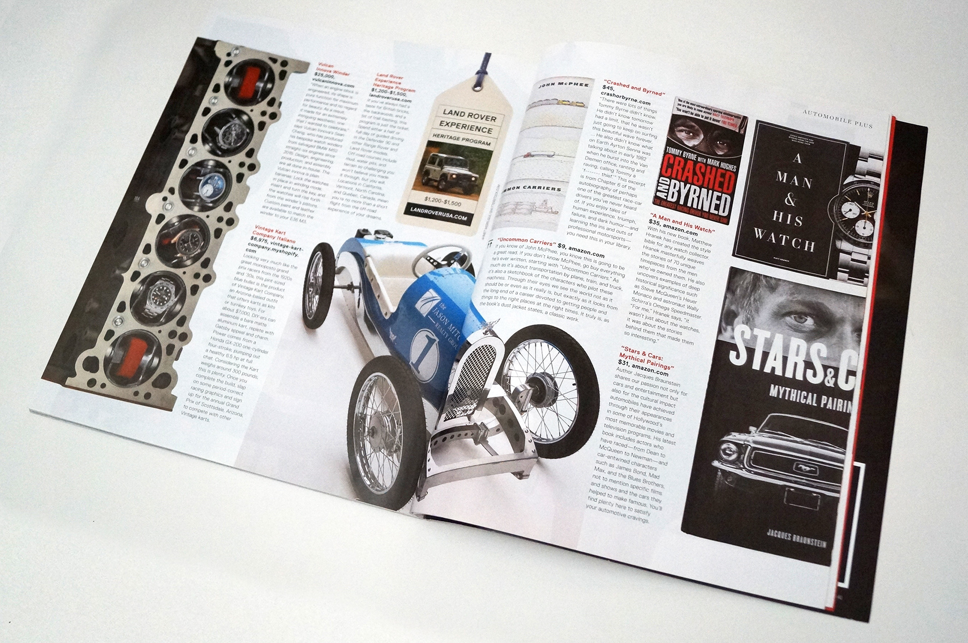
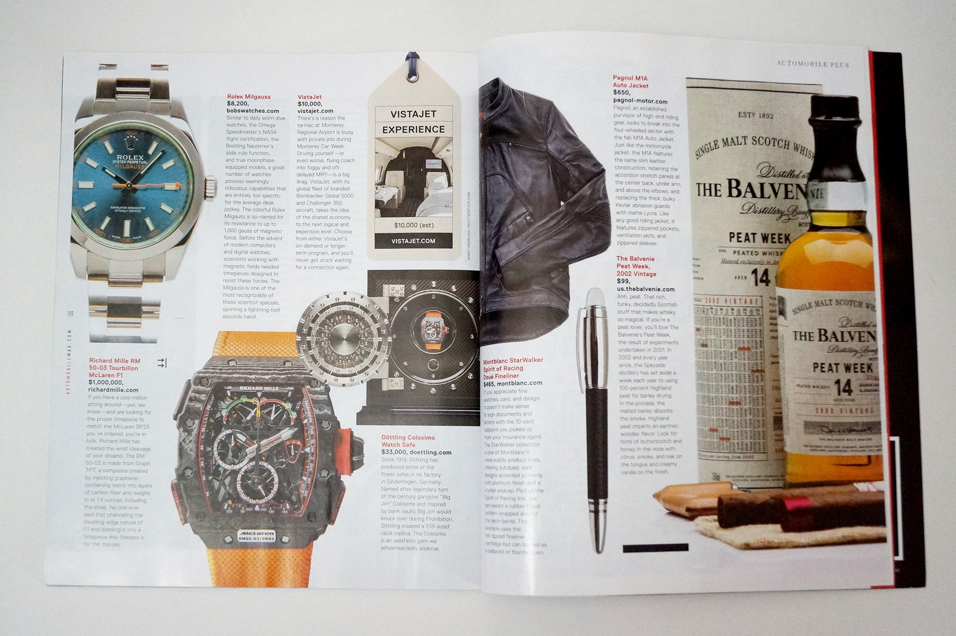
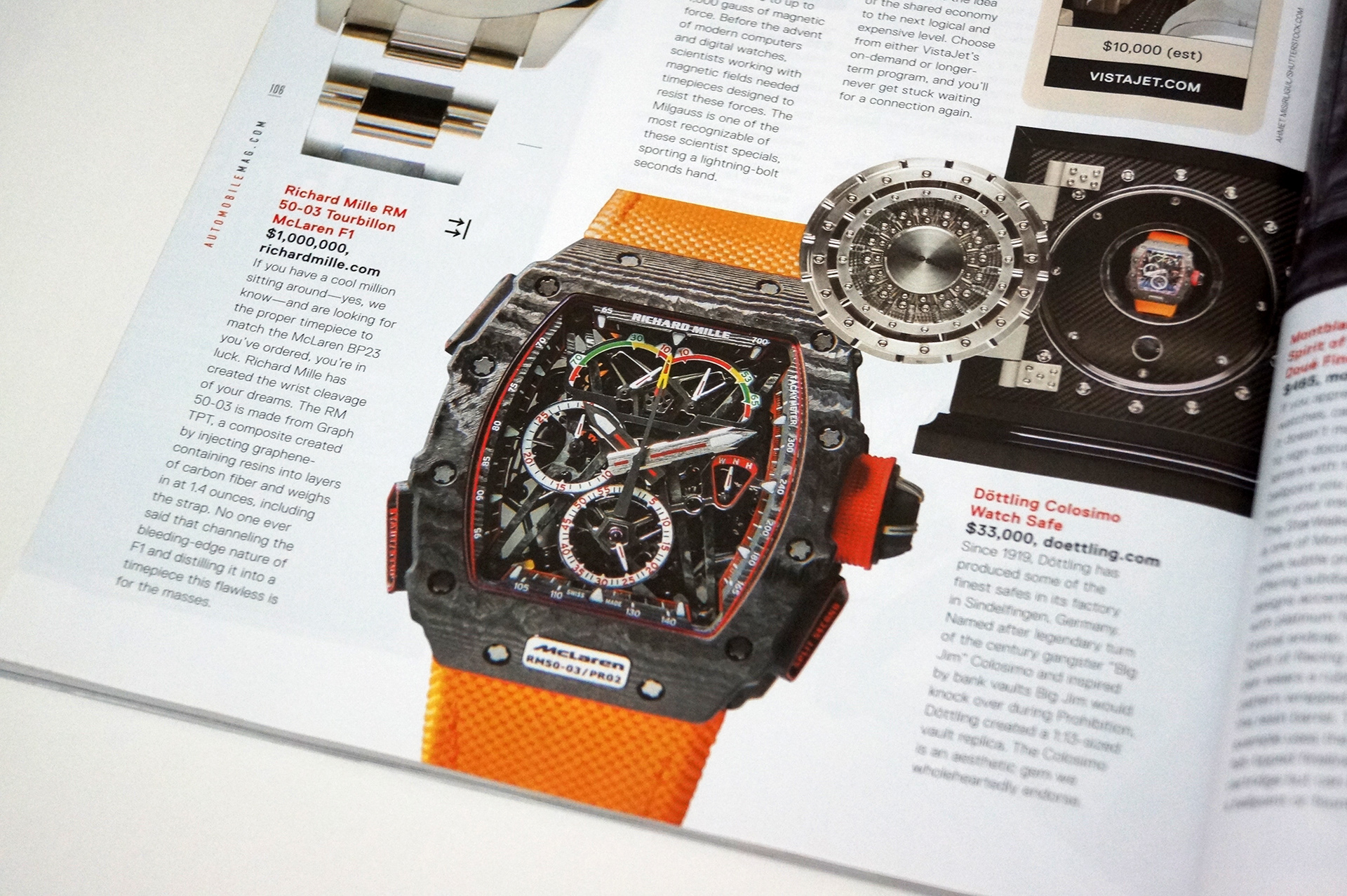
The video above is a compilation of layouts created for the refreshed magazine. The larger square format allowed for larger images to deliver a bigger impact while allowing for the use of white space to balance out the rest of the elements on the pages and prevent the content from appearing too crowded. New fonts and design elements were selected to created the new design language of the magazine.
These Drives videos were created in order to reinforce our editorial stories and reviews of different cars tested by the Automobile editorial staff. They were directly produced for social media channels but also published along their individual news article online. Music was specifically chosen to reflect each car and all footage was cut to fit within a two minute limit. Views averaged from 15,000k to 30,000k on Facebook.
