Website Design Before
One of the biggest frustrations on the old website was lack of clear storytelling and structure. A clear message was needed to explain what Rule the Outdoors campaign was. Styles also required updating to match the overall redesign of the website.
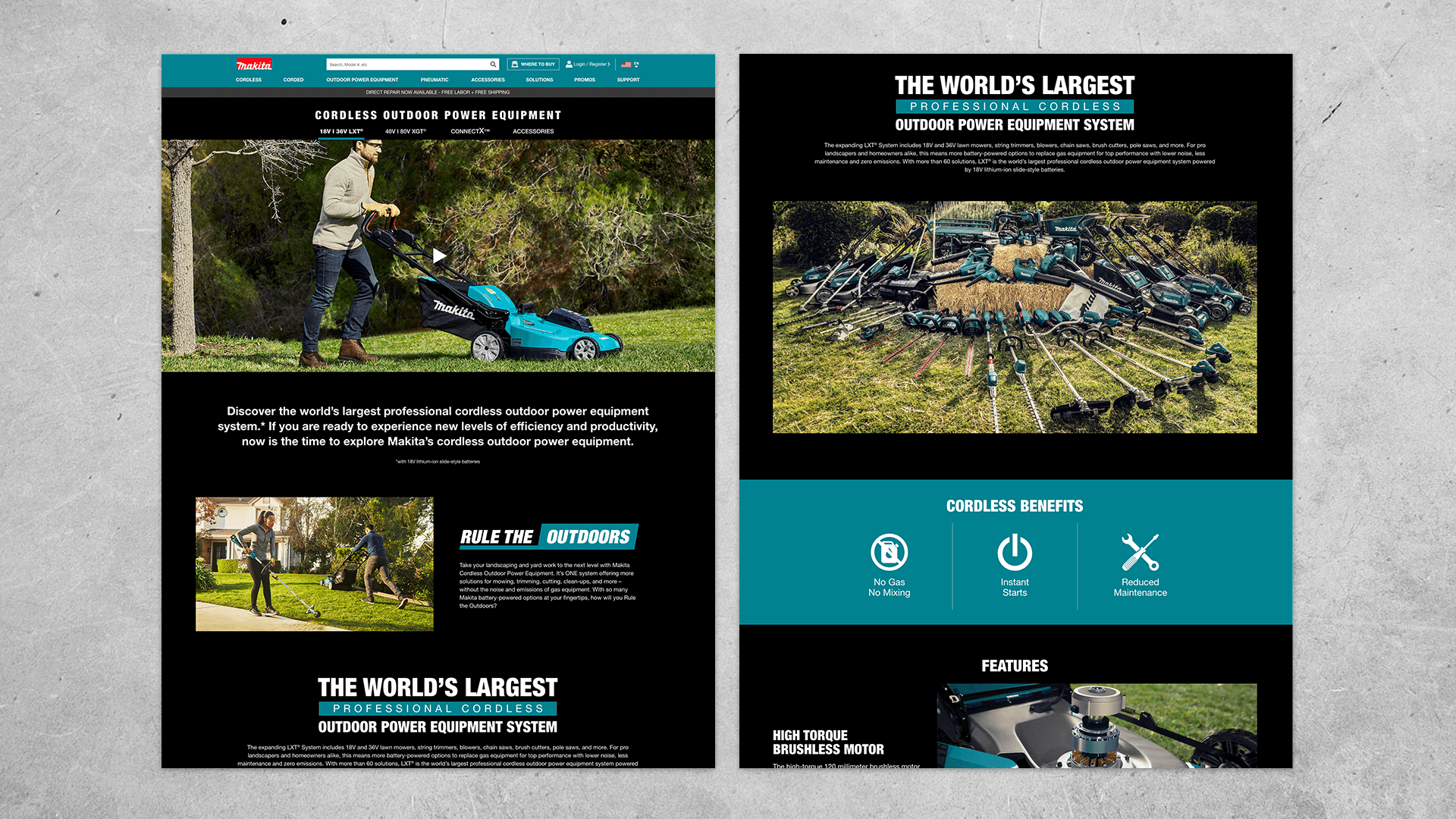
Website Design After
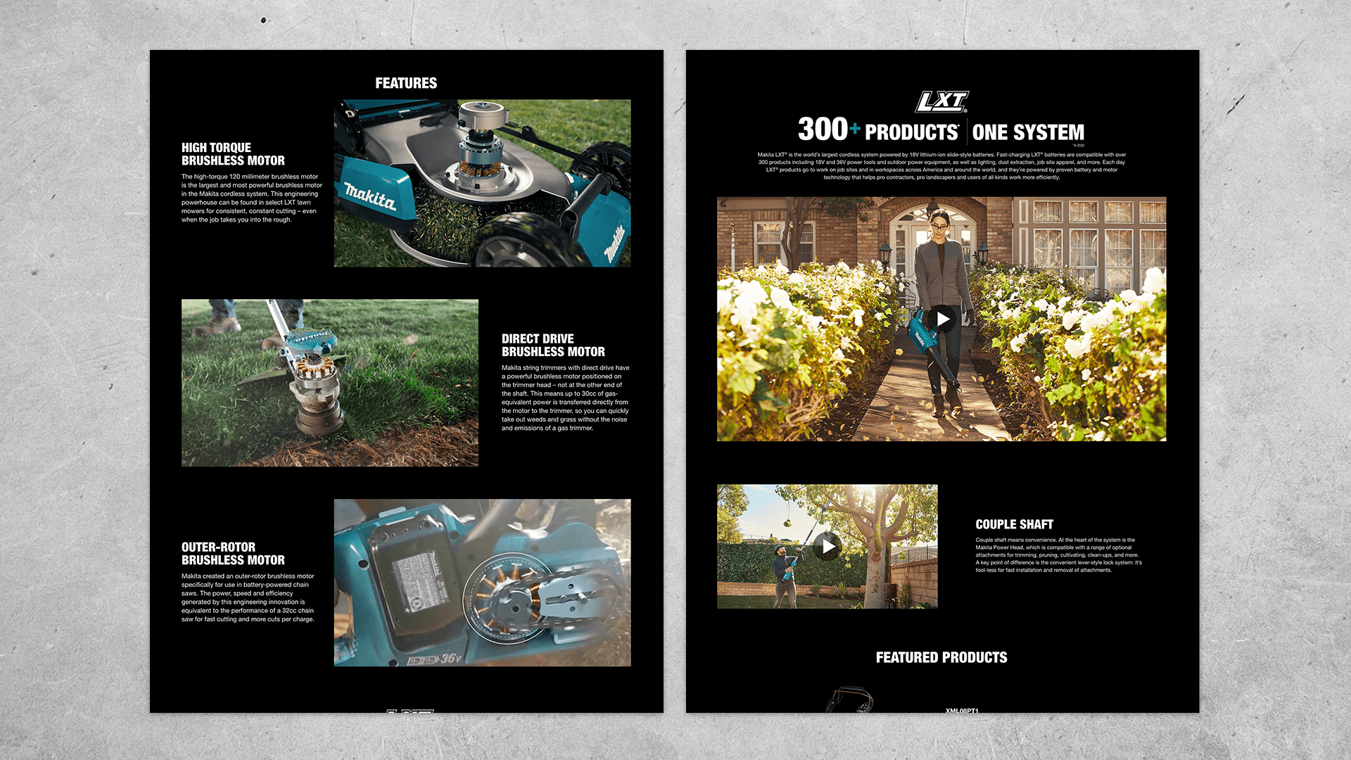
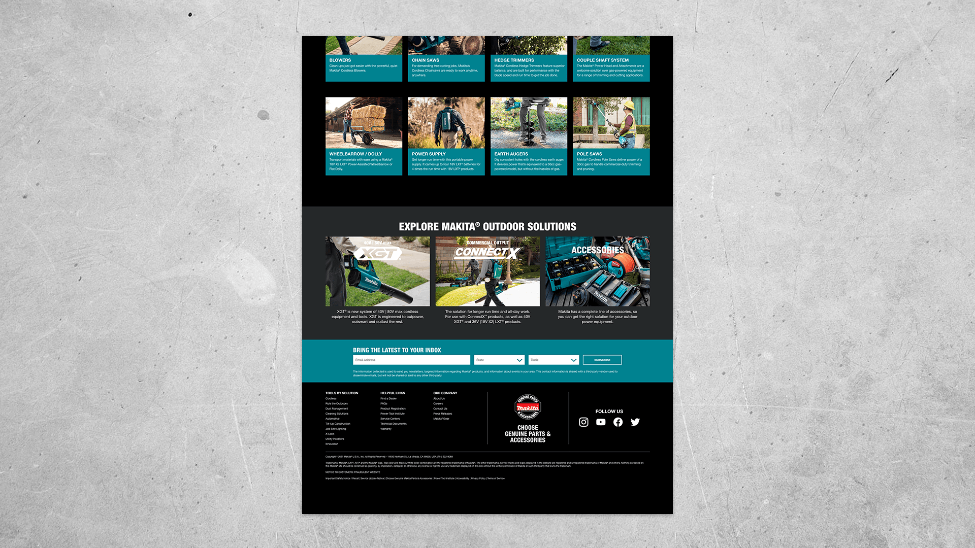
The redesign structured the content in a more organized way and fresh copy was introduced for better storytelling. Plenty of space of given to the new video content that was created for this campaign as well as the key features of the new tools being released.
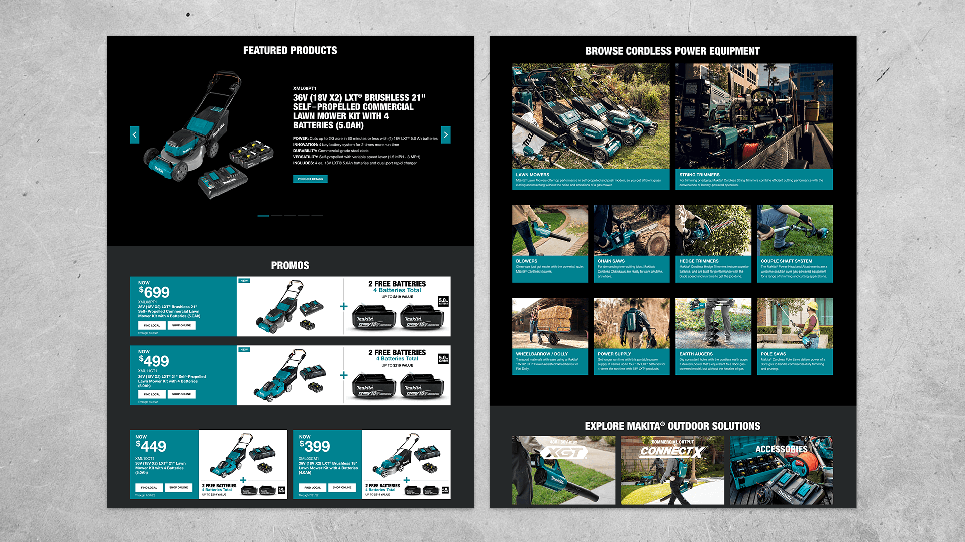
Secondary Navigation Bar
A secondary navigation bar was introduced at the top to better organize the pages within Cordless Outdoor Power Equipment. This allowed the user to freely move between pages while keeping the main navigation bar available as well.
Features Animations
GIFs were activated as the user scrolled down the page showing the key features of the new tools.
Zoom Effect
To build more energy and excitement, a zoom effect was added to the category modules towards the bottom of the page.
Mobile Design
The layout on the mobile design was carefully spaced so that the user could have plenty of time to consume the content on the page. At the top, the secondary navigation bar also allowed for easy scrolling between the other pages of this category.
To view the live page click the button below.
Email Campaign
These were the first set of emails created to start the Rule the Outdoors campaign. Some emails focused more on storytelling to bring awareness to the campaign and others presented featured products.
Digital Banners
A large variety of banners were created to raise awareness of the campaign as well as promote special offers. Fresh imagery was carefully selected for this campaign as it ran on a national level for more than half the year.
