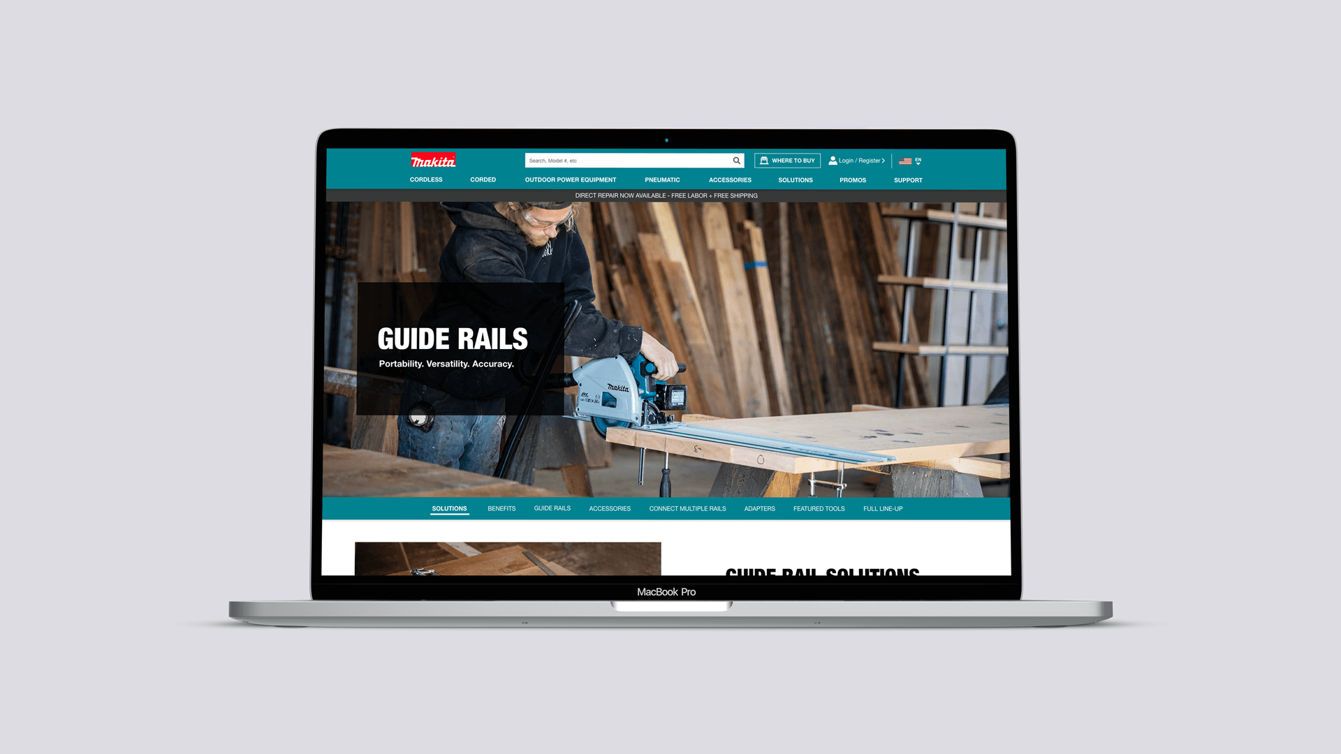
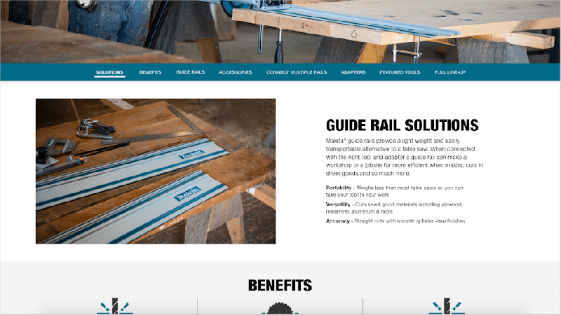
Landing Page Design
The design of this landing page was to serve as a template for future pages and therefore, modules were designed to hold content in an organized and also to seamlessly translate to mobile. In order to best tell the guide rail story, the layout of the page was divided into sections allowing the user easy navigation to the content they preferred to read.
The purpose of using guide rails is to integrate them with a cutting device (saw, router, jigsaw) which will allow you to easily cut through a door or large piece of plywood in a straight line. Most manufacturers of this product did not show the full extent of the benefits of using guide rails or the accessories required to set up the entire process so this page was meant to solve that frustration and educate customers in a better way.
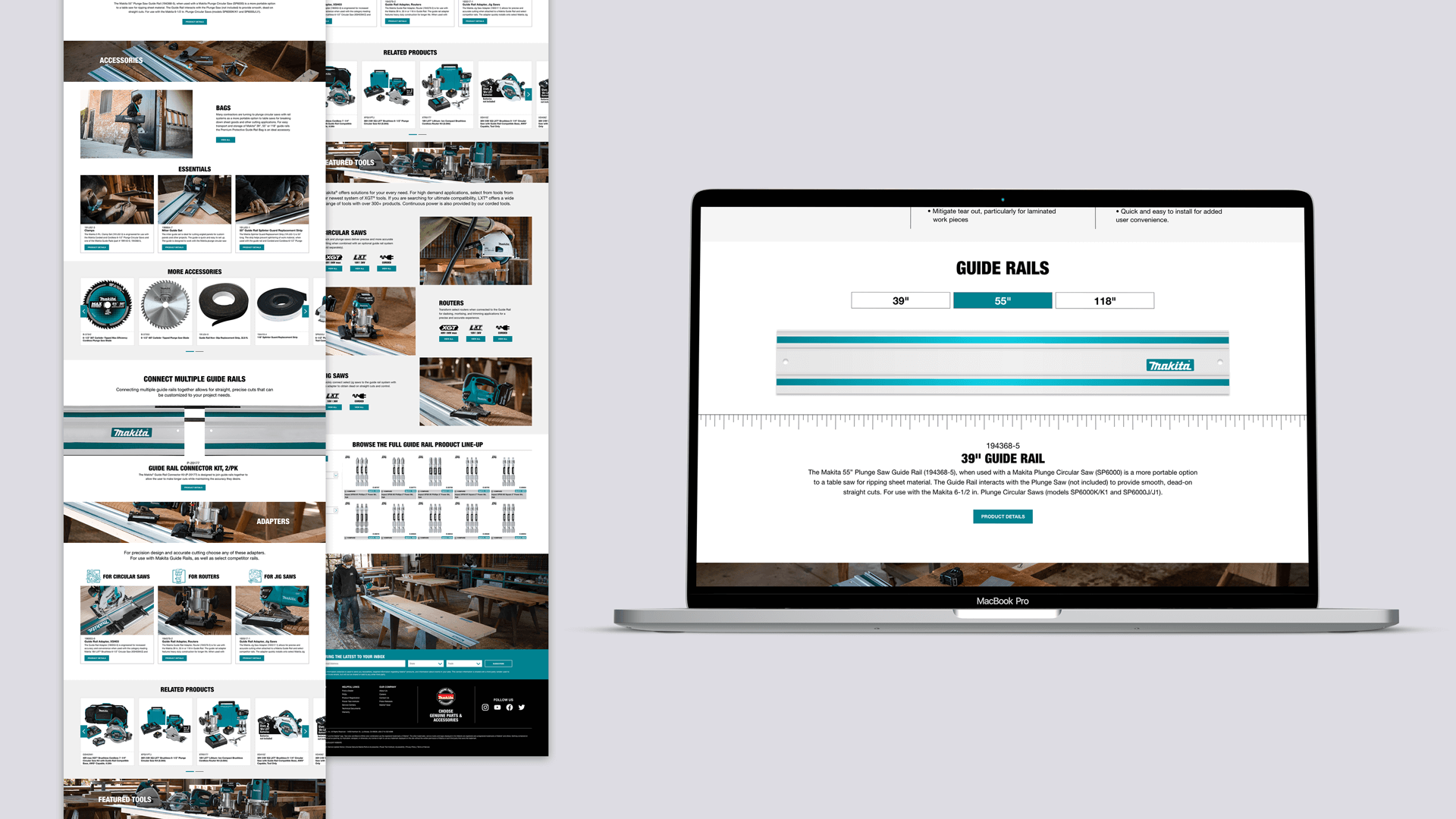
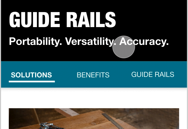
Anchor Links
At the top of the page, anchor links were used to allow the user to easily choose the category they wanted to see at any given moment. It also served to show the different type of content available on guide rails which added more value to the page overall.
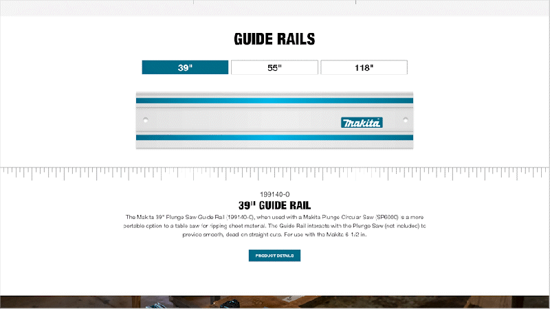
Tabs
Since there was a total of three guide rail products available for purchase, a module was needed to present that message to the user. Tabs were used here allowing for easy navigation between the three and clearly displaying the length in inches, which is valuable information for the user.
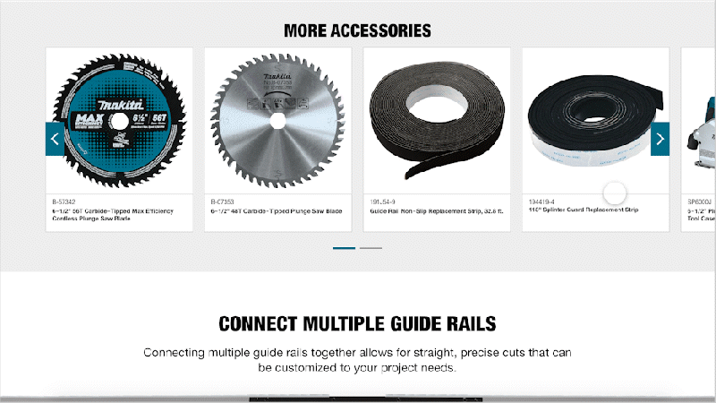
Guide Rail Animation
In order to illustrate how guide rails connect, animation was used in this section allowing customers to clearly see the connect kit needed.
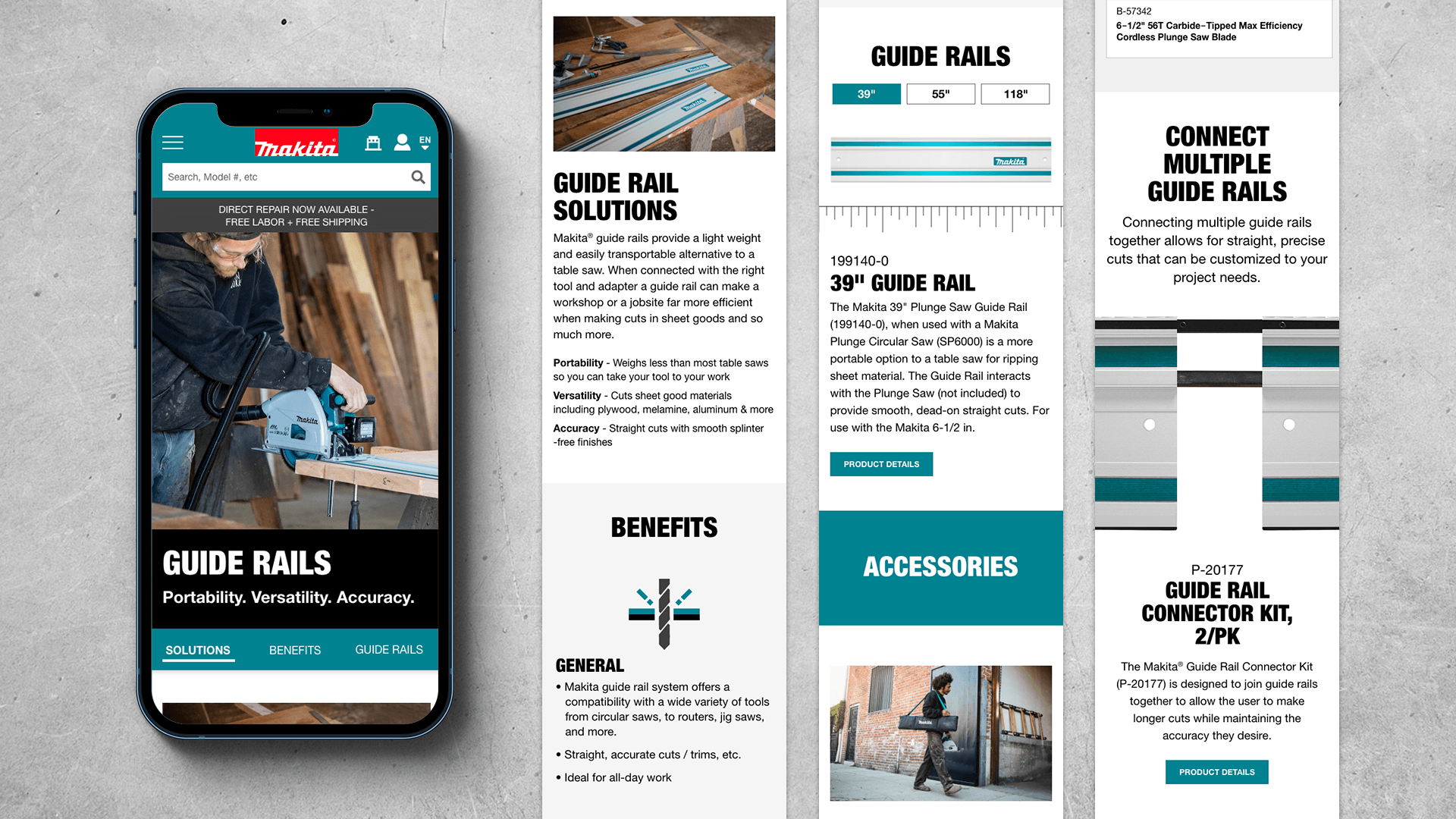
Mobile Design
All the modules on this page were designed with a mobile first approach and therefore integrated seamlessly into mobile. Light color blocks were also used in the background to beak up content for easier legibility.
Swipe Effect
The anchor links at the top of the page were given a swipe effect in mobile view so that the user could easily move between each one and click to be shown to that section.
Click the button below to see the live page.